Configuration
Each web part is configured through its settings panel. To open it, click the web part while editing the page and click the pencil (edit) icon.
1. Welcome Banner
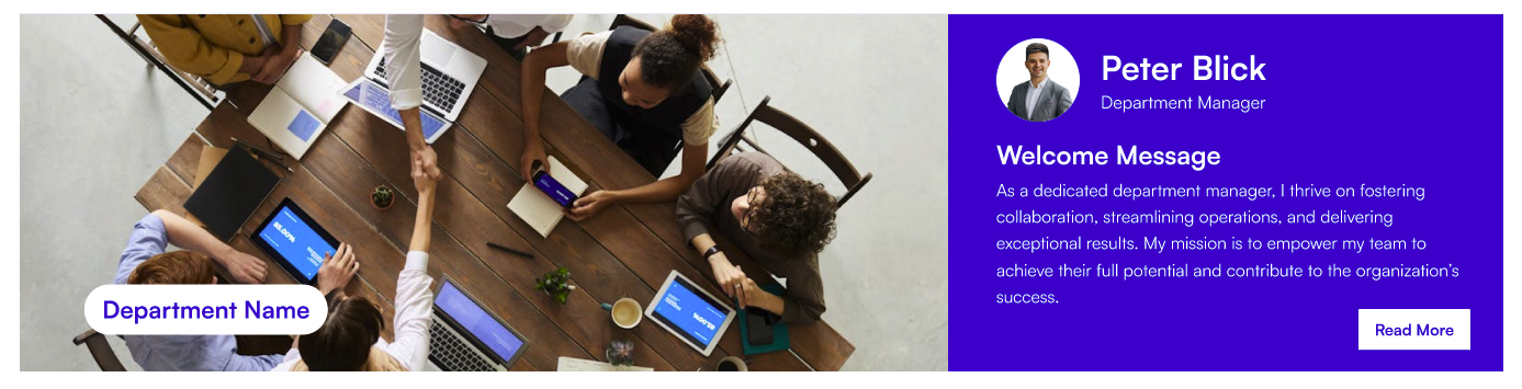
Welcome Banner
The Welcome Banner sits at the top of each sub-page and displays a full-width background image, department name, and an optional announcement or message strip. It offers two styles: Department Banner (Layout 1) and Employee Resource Banner (Layout 2).
📐 Layout Settings
| Name | Purpose | Control Type |
|---|---|---|
| Select Layout | Switch between Department Banner and Employee Resource Banner | Dropdown |
⚙️ General Settings (Department Banner — Layout 1)
| Name | Purpose | Control Type |
|---|---|---|
| Enter Department Name | The main heading shown on the banner | Text field |
| Title Position | Moves the department name up or down on the banner | Slider (1–87) |
| Banner Height | Controls the overall height of the banner | Slider (250–550 px) |
| Announcement | Opens a panel to add or edit announcement entries (see table below) | Manage panel |
| Enable Announcement Section | Shows or hides the announcement strip beneath the banner | Toggle |
| Enter Manager Message Header | Heading label above the manager message | Text field |
| Enter Read More Text | Label for the "read more" link in the announcement | Text field |
| Change Background | Select or upload the banner background image | Image picker |
Announcement Panel Fields:
| Field | Purpose |
|---|---|
| Name | Pick a person from the organisation directory (people picker) |
| Role | The person's role or title |
| Message Description | Short message or announcement text to display |
📸 View General Settings Screenshots
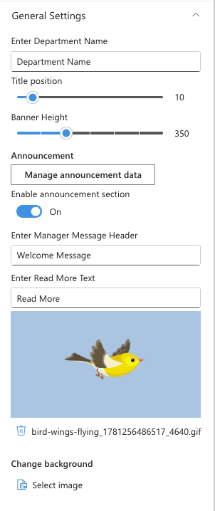
⚙️ General Settings (Employee Resource Banner — Layout 2)
| Name | Purpose | Control Type |
|---|---|---|
| Enter Department Name | Heading text shown on the banner | Text field |
| Enter Announcement Title | Bold title for the announcement block | Text field |
| Enter Announcement Description | Body text for the announcement | Multi-line text field |
| Change Background | Select or upload the banner background image | Image picker |
| Enable Announcement Section | Shows or hides the announcement block | Toggle |
📸 View General Settings (Layout 2) Screenshots
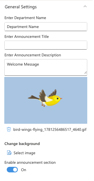
🤚🏻 Draggable Configuration Settings
| Name | Purpose | Control Type |
|---|---|---|
| Enable Draggable Components | Allows content panels on the banner to be freely repositioned | Toggle |
| Reset Component Positions | Moves all draggable panels back to their default positions | Button |
📸 View Draggable Settings Screenshots
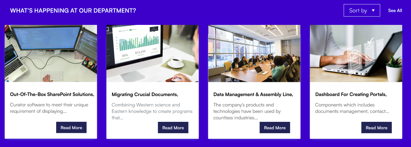
2. Featured News
Featured News
Featured News pulls news posts from one or more SharePoint sites and displays them in a chosen layout. You can filter by category, audience, or add RSS feeds from external sources.
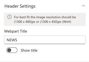
📌 Header Settings
| Name | Purpose | Control Type |
|---|---|---|
| Webpart Title | The title shown above the news section | Text field |
| Hide Title | Shows or hides the web part title | Toggle |
📸 View Header Settings Screenshots
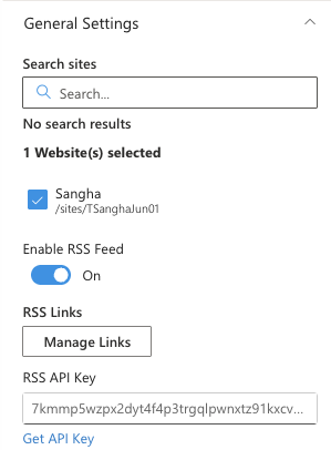
⚙️ General Settings
| Name | Purpose | Control Type |
|---|---|---|
| Search Sites | Select one or more SharePoint sites to pull news from | Site picker |
| Enable RSS Feed | Enables news from external RSS feeds alongside SharePoint news | Toggle |
| RSS Links | Opens a panel to add RSS feed URLs (visible only when RSS Feed is enabled) | Manage panel |
| RSS API Key | API key for the RSS-to-JSON service (visible only when RSS Feed is enabled) | Text field |
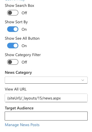
| Show Search Box | Shows a search bar above the news grid | Toggle |
| Show Sort By | Shows a sort dropdown above the news grid | Toggle |
| Show See All Button | Shows a "See All" link at the top of the web part | Toggle |
| View All URL | URL for the "See All" link (visible only when Show See All is on) | Text field |
| Show Category Filter | Shows tabs to filter news by category (visible only when the news site has choice columns) | Toggle |
| News Category | The choice column to use for category filtering | Dropdown |
| Apply Filters | Pre-filter news to show only selected category values | Multi-select |
| Target Audience | Restrict news visibility to specific users or security groups | People picker |
| Manage News Posts | Opens the site's news library directly to add or edit posts | Link |
RSS Links Panel Fields:
| Field | Purpose |
|---|---|
| Title | A friendly label for the feed (optional) |
| RSS Link | The full URL of the RSS feed |
📸 View General Settings Screenshots
 |  |
📐 Layout Settings
| Name | Purpose | Control Type |
|---|---|---|
| Choose Layout | Sets the display style: Top Story, Grid, Filmstrip, or Tiles | Dropdown |
| Border Style | Switches between Standard (all-round border) and Accent Bar (top bar only) — visible only when Show Border is on | Dropdown |
📸 View Layout Settings Screenshots

🎨 Appearance Settings
| Name | Purpose | Control Type |
|---|---|---|
| Show Border | Adds a border around each news card | Toggle |
| Height | Controls the height of the news section (Top Story and Grid layouts) | Slider |
| Items to Show | Number of news items to display (Top Story layout) | Slider (3–50) |
| Items to Show per Page | Number of items per page (Grid layout) | Slider (4–16) |
| Items to Show per Slide | Number of items visible per carousel slide (Filmstrip layout) | Slider (1–6) |
📸 View Appearance Settings Screenshots

🛠 Admin Settings
| Name | Purpose | Control Type |
|---|---|---|
| Show Admin | Shows or hides the admin section on the web part for specified users | Toggle |
| Admin Users | Pick people who can see the admin tools (visible only when Show Admin is on) | People picker |
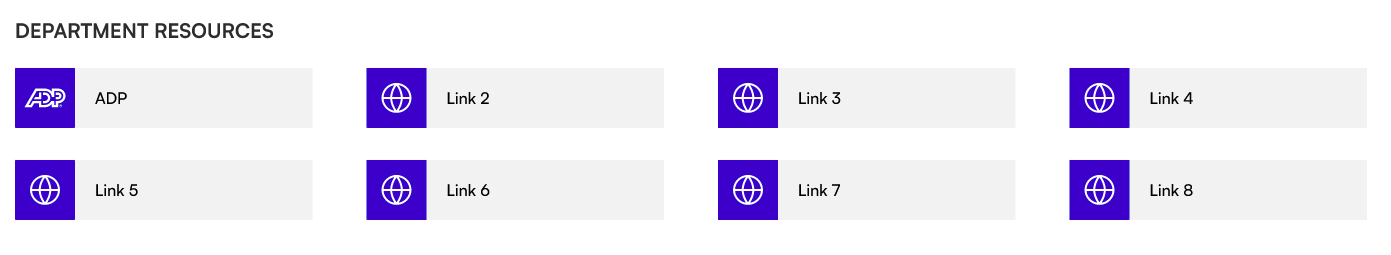
3. Common Tools
Common Tools
Common Tools displays a grid of quick-access link tiles with icons. Editors add and arrange links in a manage panel, choose how each link opens, and customize colours to match the site theme.
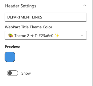
📌 Header Settings
| Name | Purpose | Control Type |
|---|---|---|
| Webpart Title | The title shown above the links grid | Text field |
| WebPart Title Theme Color | Picks a colour for the web part title from the site theme palette | Theme colour dropdown |
| Hide Title | Shows or hides the web part title | Toggle |
📸 View Header Settings Screenshots
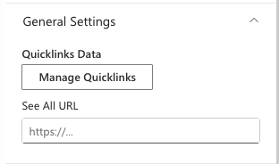
⚙️ General Settings
| Name | Purpose | Control Type |
|---|---|---|
| Quicklinks Data | Opens a panel to add, edit, reorder, and delete link tiles | Manage panel |
| See All URL | Optional URL for a "See All" link at the top of the web part | Text field |
Quicklinks Data Panel Fields:
| Field | Purpose |
|---|---|
| Title | The label shown on the tile |
| Link | The destination URL |
| Icon | Fabric icon shown on the tile (icon picker) |
| Open In | Whether the link opens in the same tab or a new tab |
📸 View General Settings Screenshots
📐 Layout Settings
| Name | Purpose | Control Type |
|---|---|---|
| Select Layout | Switch between Standard (bordered tiles) and Accent Bar (icon boxes with top bar) | Dropdown |
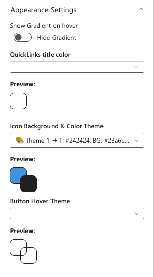
🎨 Appearance Settings
| Name | Purpose | Control Type |
|---|---|---|
| Show Gradient on Hover | Adds a gradient effect when a user hovers over a tile | Toggle |
| QuickLinks Title Color | Picks a colour for the link label text from the site theme palette | Theme colour dropdown |
| Icon Background & Color Theme | Picks colours for the icon box background and icon (Accent Bar layout only) | Theme colour dropdown |
| Button Hover Theme | Picks the hover highlight colour from the site theme palette | Theme colour dropdown |
📸 View Appearance Settings Screenshots
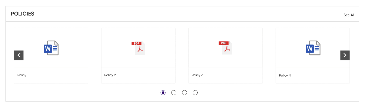
4. Document Contents
Document Contents
Document Contents surfaces files from a SharePoint document library in a chosen view. Editors can filter by folder, category, and control which file details are visible.
📌 Header Settings
| Name | Purpose | Control Type |
|---|---|---|
| Show Webpart Title | Shows or hides the web part title | Toggle |
| Title | The title shown above the document list (visible only when Show Webpart Title is on) | Text field |
📸 View Header Settings Screenshots

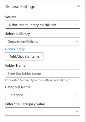
⚙️ General Settings
| Name | Purpose | Control Type |
|---|---|---|
| Source | Choose between showing all documents from this site or a specific library | Dropdown |
| Select a Library | Pick the document library to display (visible only when Source is "A document library") | Library picker |
| Goto Library | Opens the selected library directly to manage files | Link |
| Add/Update Items | Opens the library in a panel to add or update files | Button |
| Folder Name | Filter to show only files from a specific folder (type nested paths with /) | Text field |
| Include Sub-Folder Files | Also shows files from folders inside the selected folder (visible only when Folder Name is set) | Toggle |
| Category Name | The choice column to use for filtering (auto-detected from the library) | Dropdown |
| Filter the Category Value | Pre-filter documents to show only selected category values | Multi-select |
📸 View General Settings Screenshots
📐 Layout Settings
| Name | Purpose | Control Type |
|---|---|---|
| Layout Type | Display style: Film Strip, Grid, List, or Compact | Dropdown |
| Layout Style | Switch between Standard (all-round border) and Accent Bar (top bar only) | Dropdown |
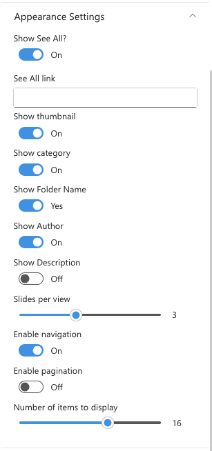
🎨 Appearance Settings
| Name | Purpose | Control Type |
|---|---|---|
| Show See All | Shows a "See All" link above the document list | Toggle |
| See All Link | URL for the "See All" link (visible only when Show See All is on) | Text field |
| Show Thumbnail | Shows a file thumbnail image (Film Strip and Grid layouts) | Toggle |
| Show Folder Name | Shows the folder the file is in (visible only when Show Thumbnail is on) | Toggle |
| Show Category | Shows the category tag on each file (visible only when the library has a category column) | Toggle |
| Show Author | Shows the file author's name | Toggle |
| Show Description | Shows the file description | Toggle |
| Slides per View | Number of files visible per slide (Film Strip layout) | Slider (1–6) |
| Enable Navigation | Shows previous/next arrows on the carousel (Film Strip layout) | Toggle |
| Enable Pagination | Shows page dots below the carousel (Film Strip layout) | Toggle |
| Number of Items to Display | Limits how many files are shown before the "See All" link appears | Slider (1–25) |
📸 View Appearance Settings Screenshots
🛠 Admin Settings
| Name | Purpose | Control Type |
|---|---|---|
| Show Admin | Shows or hides the admin view for specified users | Toggle |
| Admin Users | Pick people who can see the admin tools (visible only when Show Admin is on) | People picker |
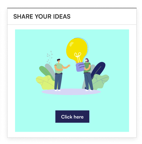
5. Feedback
Feedback
Feedback is a simple call-to-action banner with a background image and a button that directs employees to a feedback destination, such as a Microsoft Form or support mailbox.
📌 Header Settings
| Name | Purpose | Control Type |
|---|---|---|
| Webpart Title | The heading shown on the banner | Text field |
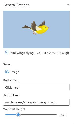
⚙️ General Settings
| Name | Purpose | Control Type |
|---|---|---|
| Select Image | Background image for the banner | Image picker |
| Button Text | Label on the call-to-action button (e.g., "Share Your Ideas") | Text field |
| Action Link | URL the button navigates to (e.g., a Microsoft Form or email link) | Text field |
| Webpart Height | Controls the height of the banner | Slider (100–1000 px) |
📸 View General Settings Screenshots
📐 Layout Settings
| Name | Purpose | Control Type |
|---|---|---|
| Layout | Switch between Standard and Accent Bar | Dropdown |
6. Goals
Goals
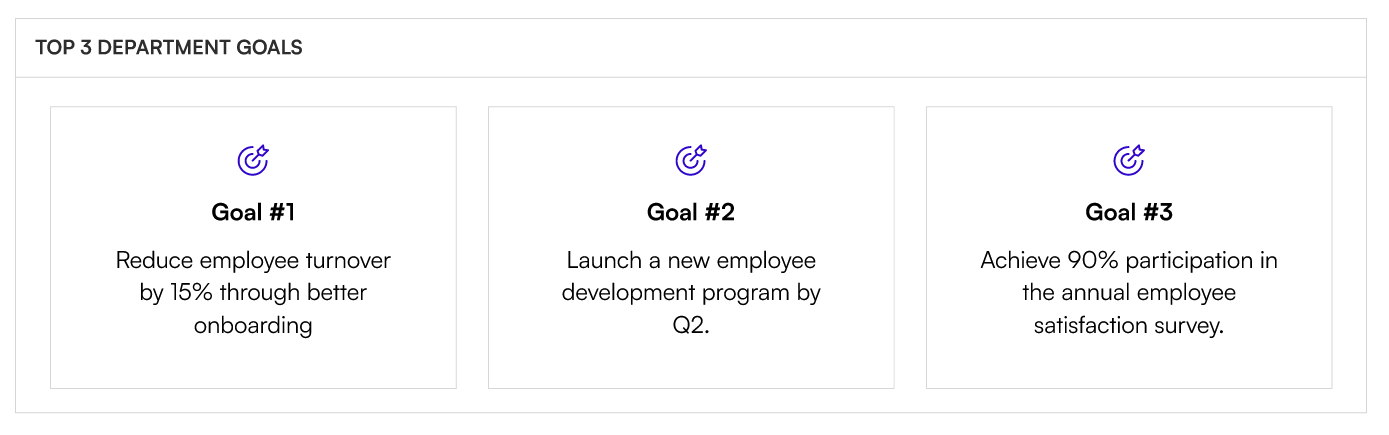
Goals displays your department or team's key objectives as visual cards with an icon, title, description, and optional link. Cards can be reordered in the manage panel.
📌 Header Settings
| Name | Purpose | Control Type |
|---|---|---|
| Enter Webpart Title | The title shown above the goals grid | Text field |
⚙️ General Settings
| Name | Purpose | Control Type |
|---|---|---|
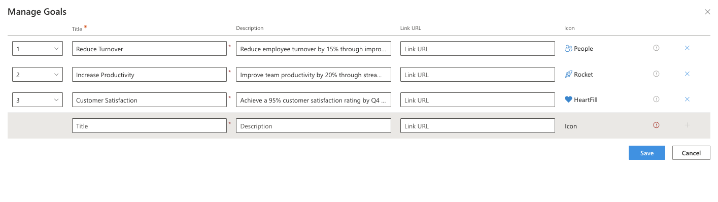
| Goals | Opens a panel to add, edit, reorder, and delete goal cards | Manage panel |
Goals Panel Fields:
| Field | Purpose |
|---|---|
| Title | The goal heading |
| Description | A short description of the goal |
| Link URL | Optional link to a related page or document |
| Icon | Fabric icon shown on the card (icon picker) |
📸 View General Settings Screenshots
📐 Layout Settings
| Name | Purpose | Control Type |
|---|---|---|
| Select Layout | Switch between Standard and Accent Bar | Dropdown |
🎨 Appearance Settings
| Name | Purpose | Control Type |
|---|---|---|
| Text Alignment | Aligns the card text: Left, Centre, or Right | Dropdown |
| Show Full Description | Shows the complete description text without truncation | Toggle |
📸 View Appearance Settings Screenshots

7. Newsletter
Newsletter
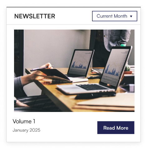
Newsletter pulls editions from a SharePoint document library and displays them as a gallery with cover images, titles, and a "Read More" link. A month filter lets employees browse past editions, and an optional carousel lets editors showcase multiple issues at once.
📌 Header Settings
| Name | Purpose | Control Type |
|---|---|---|
| Webpart Title | The title shown above the newsletter gallery | Text field |
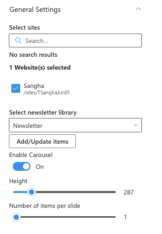
⚙️ General Settings
| Name | Purpose | Control Type |
|---|---|---|
| Select Sites | Pick the SharePoint site that hosts the newsletter library | Site picker |
| Select Newsletter Library | Pick the document library containing newsletter editions (visible only when a site is selected) | Library picker |
| Add/Update Items | Opens the library in a panel to upload or update newsletters | Button |
| Enable Carousel | Switches to a carousel display for multiple editions | Toggle |
| Height | Controls the height of the web part | Slider (200–700 px) |
| Number of Items per Slide | How many editions are visible per slide (visible only when Enable Carousel is on) | Slider (1–10) |
📸 View General Settings Screenshots
📐 Layout Settings
| Name | Purpose | Control Type |
|---|---|---|
| Layout | Switch between Standard and Accent Bar | Dropdown |
🛠 Admin Settings
| Name | Purpose | Control Type |
|---|---|---|
| Show Admin | Shows or hides the admin section for specified users | Toggle |
| Admin Users | Pick people who can see admin tools (visible only when Show Admin is on) | People picker |
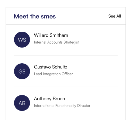
8. The Team
The Team
The Team displays a curated list of team members or subject-matter experts (SMEs) with their profile photo, role, and an optional custom name. Cards can be shown as a static grid or in a scrollable carousel.
📌 Header Settings
| Name | Purpose | Control Type |
|---|---|---|
| Webpart Title | The title shown above the team grid | Text field |
| See All Link | URL for a "See All" or "Meet the Team" link | Text field |
📸 View Header Settings Screenshots

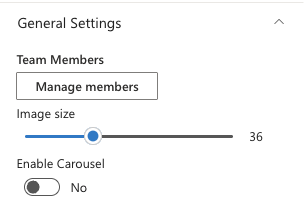
⚙️ General Settings
| Name | Purpose | Control Type |
|---|---|---|
| Team Members | Opens a panel to add, edit, and reorder team member cards | Manage panel |
| Image Size | Controls the size of profile photos | Slider (5–100) |
| Enable Carousel | Switches the display to a scrollable carousel | Toggle |
| Show Navigation | Shows previous/next arrows on the carousel (visible only when Enable Carousel is on) | Toggle |
| Items to Show per Slide | How many member cards are visible per slide (visible only when Enable Carousel is on) | Slider (1–10) |
Team Members Panel Fields:
| Field | Purpose |
|---|---|
| Person | Pick a person from the organisation directory (people picker) |
| Role | Optional role or title to display beneath the person's name |
| Custom Display Name | Optional alternative name to display instead of the person's Microsoft 365 display name |
📸 View General Settings Screenshots
📐 Layout Settings
| Name | Purpose | Control Type |
|---|---|---|
| Select Layout | Switch between Standard and Accent Bar | Dropdown |