Configuration
This page covers how to configure each web part in DIY Intranet Home. All settings are managed through the property panel on the right-hand side of the page — no code or technical knowledge is required.
To open the settings panel, edit the page and click the Edit Properties (icon) on any web part.
Understanding Layouts
Every web part supports two layout options that can be switched at any time from the Layout settings group.
| Layout | Description |
|---|---|
| Layout 1 — Standard | Clean card-based style with borders on all sides of each item. |
| Layout 2 — Accent Bar | Modern style with a coloured top border only. |
Understanding Theme Colours
All colour dropdowns in DIY Intranet Home read your site's theme palette automatically. When you select a colour, a swatch preview appears below the dropdown so you can see the result before saving. You can also use the full colour picker to enter any custom hex value.
1. Welcome Banner
1. Welcome Banner
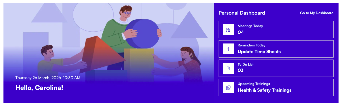
The Welcome Banner greets each employee by name with a live clock and a customisable background image. Below the greeting, personal dashboard cards surface the user's meetings, tasks, and training from their Microsoft 365 account.
⚙️ General Settings
| Name | Purpose | Control Type |
|---|---|---|
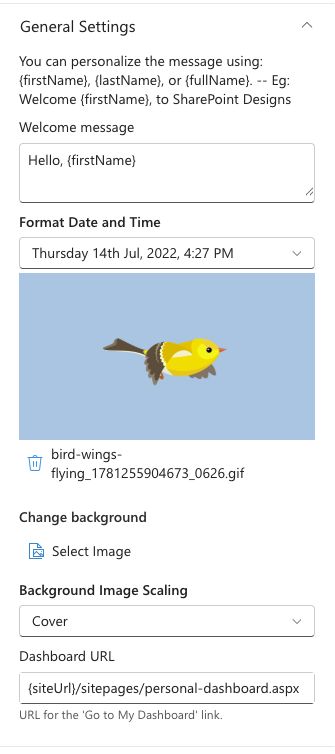
| Welcome message | The greeting text displayed on the banner. Use {firstName}, {lastName}, or {fullName} as placeholders replaced with the logged-in user's name (e.g. Welcome back, {firstName}!). | Text field |
| Format Date and Time | Controls how the date and time are displayed below the greeting. | Dropdown |
| Change background | Upload or select a background image for the banner. Stored in Site Assets. | File picker |
| Background Image Scaling | How the background image fills the banner area. Options: Cover, Contain, Auto, Stretch, Center. | Dropdown |
| Dashboard URL | The web address for the "Go to My Dashboard" link on the banner. Leave blank to hide the link. | Text field |
📸 View General Settings Screenshots
📐 Layout Settings
| Name | Purpose | Control Type |
|---|---|---|
| Choose Layout | Switch between Layout 1 (standard banner) and Layout 2 (banner with a separate dashboard panel below). | Dropdown |
📸 View Layout Settings Screenshots

🎨 Appearance Settings
| Name | Purpose | Control Type |
|---|---|---|
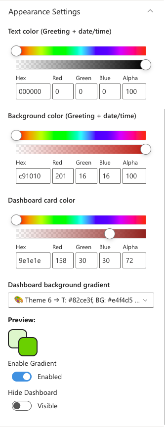
| Text color (Greeting + date/time) | Colour of the greeting text and clock. | Colour picker |
| Background color (Greeting + date/time) | Background colour behind the greeting text area. Useful for readability over busy photos. | Colour picker |
| Dashboard card color | Background colour for the personal dashboard cards. Visible when the dashboard is shown. | Colour picker |
| Dashboard background gradient | Choose a gradient from your site's theme palette for the dashboard section background. Available in Layout 2 when gradient is enabled. | Dropdown |
| Dashboard background color | Solid colour for the dashboard background. Shown when gradient is disabled in Layout 2. | Colour picker |
| Enable Gradient | Toggle the gradient effect on or off for the dashboard background. | Toggle |
| Hide Dashboard | When on, the personal dashboard cards are hidden and only the greeting banner is shown. | Toggle |
📸 View Appearance Settings Screenshots
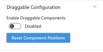
🤚🏻 Draggable Configuration
| Name | Purpose | Control Type |
|---|---|---|
| Enable Draggable Components | When on, users can drag user welcome cards around and their positions are saved. | Toggle |
| Reset Component Positions | Moves cards back to their original default positions. | Button |
📸 View Draggable Settings Screenshots
2. Announcement
2. Announcement
The Announcement web part shows a rotating carousel of company messages. Each announcement can include a link, an expiry date for automatic removal, and an optional icon image.

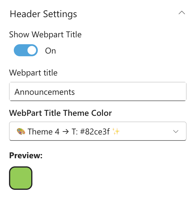
📌 Header Settings
| Name | Purpose | Control Type |
|---|---|---|
| Show Webpart Title | Toggle the title bar above the carousel on or off. | Toggle |
| Webpart title | The heading text shown above the carousel (e.g. "Announcements"). Visible only when the title is on. | Text field |
| WebPart Title Theme Color | Colour for the title text, chosen from the site's theme palette. A preview swatch appears below. | Dropdown |
📸 View Header Settings Screenshots
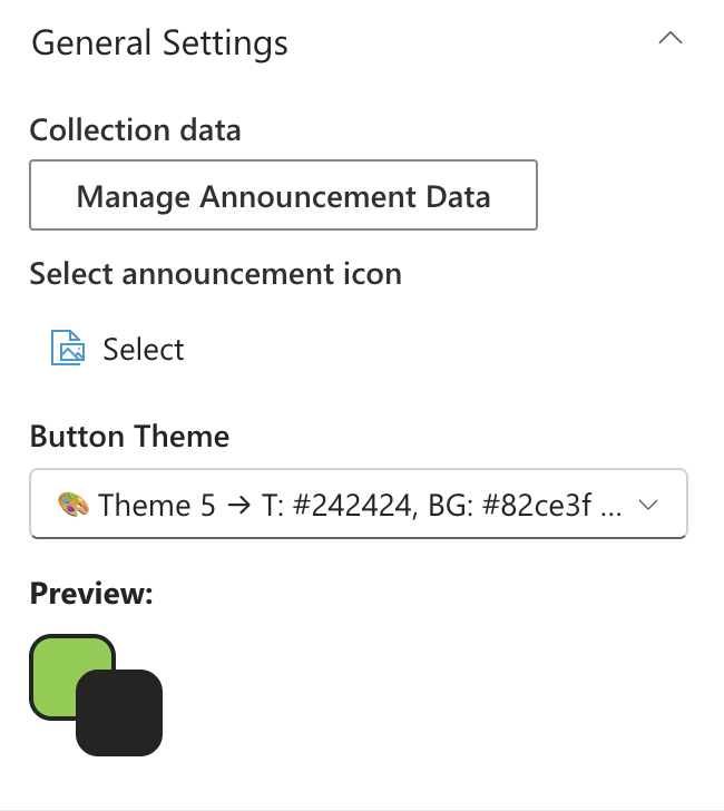
⚙️ General Settings
| Name | Purpose | Control Type |
|---|---|---|
| Manage Announcement Data | Opens a panel to add, edit, remove, and reorder announcements. | Collection data |
| Select announcement icon | Upload or select an image to use as an icon beside the announcement text. Stored in Site Assets. | File picker |
| Button Theme | Colour theme for the carousel navigation buttons, from the site's palette. | Dropdown |
Fields inside Manage Announcement Data:
| Field | Purpose | Control Type |
|---|---|---|
| URL | A web address the announcement links to. Leave blank for no link. | URL field |
| TargetWindow | Whether the link opens in a new tab or the same tab. | Dropdown |
| ExpiryDate | The date after which this announcement is hidden automatically. | Date picker |
| Description | The announcement text. Required. Supports multiple lines. | Text area |
📸 View General Settings Screenshots
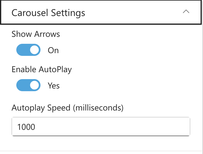
⚙️ Carousel Settings
| Name | Purpose | Control Type |
|---|---|---|
| Show Arrows | Toggle the left/right navigation arrows on the carousel. | Toggle |
| Enable AutoPlay | When on, the carousel advances automatically. | Toggle |
| Autoplay Speed (milliseconds) | How long each slide is shown before advancing. Default: 5000 (5 seconds). Active only when AutoPlay is on. | Text field |
📸 View Carousel Settings Screenshots
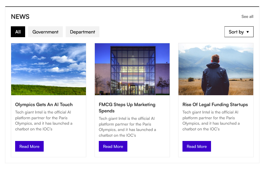
3. Featured News
3. Featured News
The Featured News web part aggregates SharePoint news posts from one or more sites and displays them in a variety of layouts. It also supports RSS feeds and audience targeting.
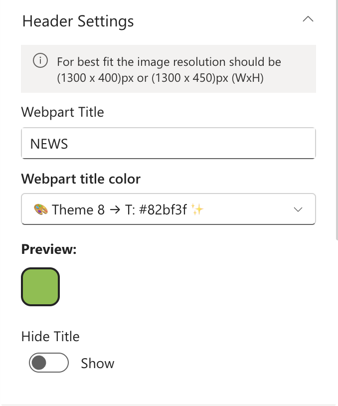
📌 Header Settings
| Name | Purpose | Control Type |
|---|---|---|
| Webpart Title | Heading shown above the news feed (e.g. "Latest News"). | Text field |
| Webpart title color | Colour for the title text, from the site's theme palette. | Dropdown |
| Hide / Show title | Toggle the title bar on or off. | Toggle |
📸 View Header Settings Screenshots
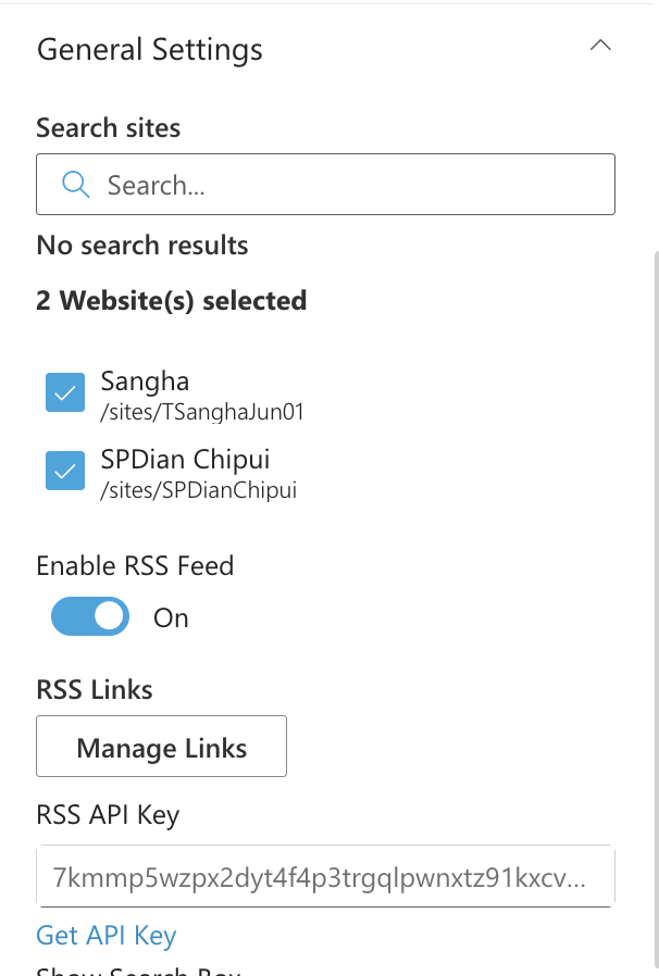
⚙️ General Settings
| Name | Purpose | Control Type |
|---|---|---|
| Search sites | Select one or more SharePoint sites to pull news from. The current site is selected by default. | Site picker |
| One view height (px) | Height of the news display area in Layout 1. Range: 100–500 px. | Slider |
| Enable RSS Feed | Toggle to add external RSS news sources alongside SharePoint news. | Toggle |
| RSS Links | Add RSS feed URLs with optional titles. Visible only when RSS Feed is enabled. | Collection data |
| RSS API Key | API key from rss2json.com to convert RSS feeds. A link to get a free key is provided below the field. Visible only when RSS Feed is enabled. | Text field |
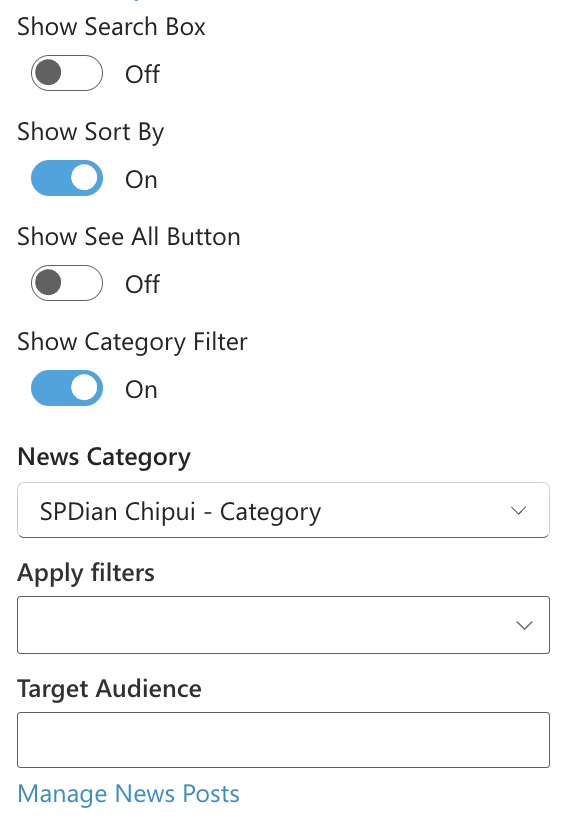
| Show Search Box | Toggle a keyword search box for users to filter news. | Toggle |
| Show Sort By | Toggle a sort control so users can sort news by date or relevance. | Toggle |
| Show See All Button | Toggle a "See All" button linking to the full news listing. | Toggle |
| View All URL | Web address for the "See All" button. Visible only when the button is on. | Text field |
| Show Category Filter | Toggle category tabs above the news for filtering by topic. | Toggle |
| News Category | The choice column used to drive the category filter tabs. Populated automatically from selected sites. | Dropdown |
| Apply filters | Pre-select one or more category values to filter the feed to specific topics only. | Multi-select |
| Target Audience | Restrict who sees this web part to specific people or security groups. Leave blank to show to everyone. | People picker |
| Manage News Posts | Quick link to the news management page for the current site. | Link |
📸 View General Settings Screenshots
 |  |
📐 Layout Settings
| Name | Purpose | Control Type |
|---|---|---|
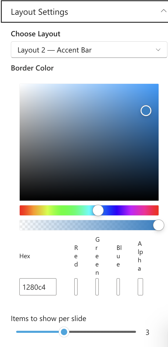
| Choose Layout | Select Layout 1 (Standard full-view) or Layout 2 (Accent Bar with top border). | Dropdown |
| Border Color | Colour of the top accent border. Visible only in Layout 2. | Colour picker |
| Items to show per slide | Number of news cards shown side-by-side in the filmstrip. Range: 1–6. Visible only in Layout 2. | Slider |
📸 View Layout Settings Screenshots
🛠 Admin Settings
| Name | Purpose | Control Type |
|---|---|---|
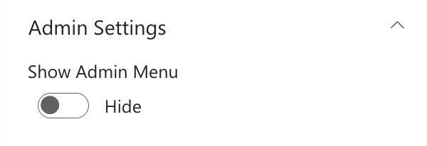
| Show / Hide admin badge | Toggle an admin badge visible only to designated administrators. | Toggle |
| Web Part Admin | People or groups who are administrators of this web part. They see the admin badge. | People picker |
📸 View Admin Settings Screenshots
4. Quicklinks
4. Quicklinks
The Quicklinks web part is a quick links panel for the apps and tools your team uses every day. Each link supports a title, URL, Fluent UI icon, and open-in option.

📌 Header Settings
| Name | Purpose | Control Type |
|---|---|---|
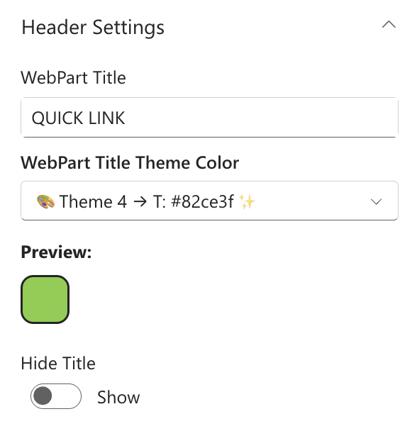
| Webpart Title | Heading shown above the quick links (e.g. "Quick Links"). | Text field |
| WebPart Title Theme Color | Colour for the title text, from the site's theme palette. | Dropdown |
| Hide / Show title | Toggle the title bar on or off. | Toggle |
📸 View Header Settings Screenshots
⚙️ General Settings
| Name | Purpose | Control Type |
|---|---|---|
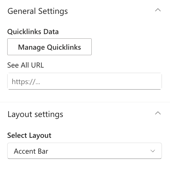
| Manage Quicklinks | Opens a panel to add, edit, remove, and reorder links. | Collection data |
| See All URL | Web address for a "See All" link at the top-right of the web part. Leave blank to hide. | Text field |
Fields inside Manage Quicklinks:
| Field | Purpose | Control Type |
|---|---|---|
| Title | Display name for the link tile (e.g. "HR Portal"). Required. | Text field |
| Link | The full URL the tile navigates to. Required. | URL field |
| Icon | A Fluent UI icon shown on the tile. Choose from a visual icon picker. | Icon picker |
| Open In | Whether the link opens in a new tab or the same tab. | Dropdown |
📸 View General Settings Screenshots
📐 Layout Settings
| Name | Purpose | Control Type |
|---|---|---|
| Select Layout | Switch between Standard (icon tile grid) and Accent Bar (list with top border). | Dropdown |
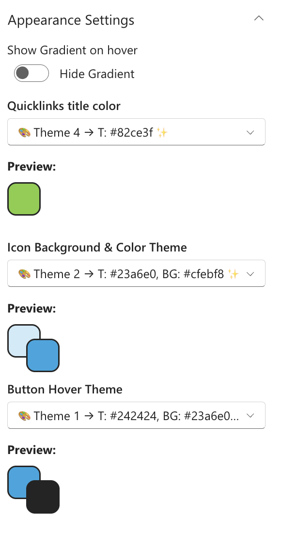
🎨 Appearance Settings
| Name | Purpose | Control Type |
|---|---|---|
| Show Gradient on hover | When on, a gradient overlay appears on tiles when a user hovers over them. | Toggle |
| Quicklinks title color | Colour for the link title text, from the site's theme palette. | Dropdown |
| Icon Background & Color Theme | Background and icon colour theme for icon boxes. Shown only in Accent Bar layout. | Dropdown |
| Button Hover Theme | Hover colour theme for link tiles, from the site's theme palette. | Dropdown |
📸 View Appearance Settings Screenshots
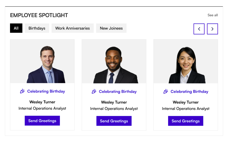
5. Employee Spotlight
5. Employee Spotlight
The Employee Spotlight web part surfaces upcoming birthdays, work anniversaries, and recent new joiners. Data is pulled automatically from Azure Active Directory or managed manually.
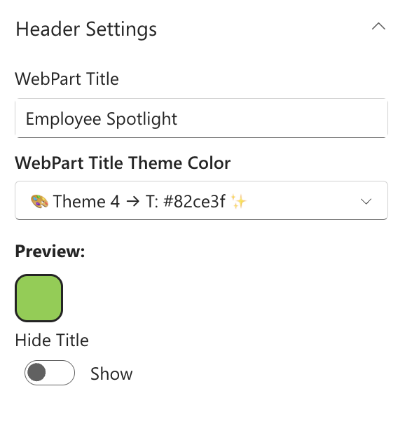
📌 Header Settings
| Name | Purpose | Control Type |
|---|---|---|
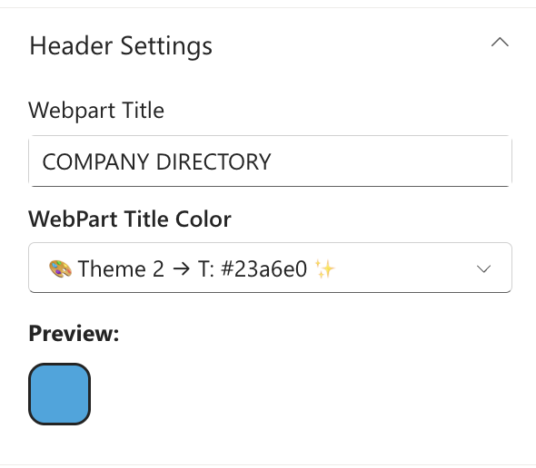
| Webpart Title | Heading shown above the spotlight cards (e.g. "Celebrate Our People"). | Text field |
| WebPart Title Theme Color | Colour for the title text, from the site's theme palette. | Dropdown |
| Hide / Show title | Toggle the title bar on or off. | Toggle |
📸 View Header Settings Screenshots
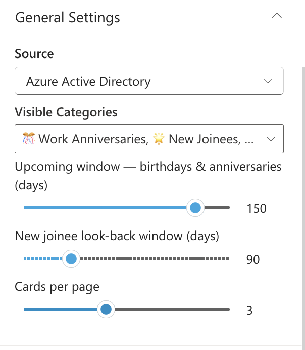
⚙️ General Settings
| Name | Purpose | Control Type |
|---|---|---|
| Source | Choose where data comes from: Azure Active Directory (automatic) or Property Collection (manual). | Dropdown |
| Spotlight data | Opens a panel to add people manually. Visible only when Source is set to Property Collection. | Collection data |
| Visible Categories | Choose which milestones to show: Birthdays, Work Anniversaries, New Joinees — any combination. | Multi-select |
| Upcoming window — birthdays & anniversaries (days) | How many days ahead to look for upcoming birthdays and anniversaries. Range: 1–180 days. Default: 7. | Slider |
| New joinee look-back window (days) | How many days back to consider someone a new joiner. Range: 7–365 days. Default: 90. | Slider |
| Cards per page | How many spotlight cards are shown at once. Range: 1–6. Default: 3. | Slider |
Fields inside Spotlight data (Property Collection mode):
| Field | Purpose | Control Type |
|---|---|---|
| Person | Search for and select a person from your organisation. | People picker |
| Job Title | The person's job title. | Text field |
| Department | The person's department. | Text field |
| Category | The milestone type: Birthday, Anniversary, or New Joinee. Required. | Dropdown |
| Celebration Date (MM-DD) | The month and day of the person's birthday or anniversary. | Custom date picker |
📸 View General Settings Screenshots
📐 Layout Settings
| Name | Purpose | Control Type |
|---|---|---|
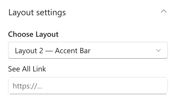
| Choose Layout | Switch between Layout 1 (Standard) and Layout 2 (Accent Bar). | Dropdown |
| See All URL | Web address for a "See All" link at the top-right of the web part. | Text field |
📸 View Layout Settings Screenshots
🎨 Appearance Settings
| Name | Purpose | Control Type |
|---|---|---|
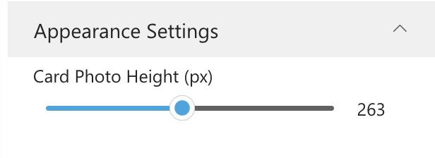
| Card Photo Height (px) | Height of the employee photo area on each card. Range: 140–400 px. Default: 240. | Slider |
📸 View Appearance Settings Screenshots
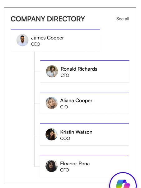
6. Org Chart
6. Org Chart
The Org Chart web part draws an interactive organisational tree from Microsoft 365. Hover over any person to see their contact details.
📌 Header Settings
| Name | Purpose | Control Type |
|---|---|---|
| Webpart Title | Heading shown above the org chart. | Text field |
| WebPart Title Color | Colour for the title text, from the site's theme palette. | Dropdown |
📸 View Header Settings Screenshots
⚙️ General Settings
| Name | Purpose | Control Type |
|---|---|---|
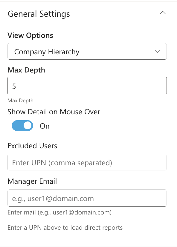
| View Options | What the chart displays: Show My Team (the logged-in user's team), Company Hierarchy (full company tree), or Show Other Team (a specific manager's team). | Dropdown |
| Max Depth | How many hierarchy levels are expanded automatically. Range: 1–10. | Number field |
| Show Detail on Mouse Over | When on, hovering over a person shows a popup with their contact details. | Toggle |
| Excluded Users | Email addresses (comma-separated) of people who should not appear in the chart. | Text field |
| Manager Email | Email address of the manager whose team to display. Required when View Options is set to Show Other Team. | Text field |
| Reorder Org Chart Users | Use the up/down buttons to change the display order of a manager's direct reports. Appears after a Manager Email is entered. | Custom reorder control |
📸 View General Settings Screenshots
📐 Layout Settings
| Name | Purpose | Control Type |
|---|---|---|
| Layout | Switch between Standard (Layout 1) and Accent Bar (Layout 2). | Dropdown |
🎨 Appearance Settings
| Name | Purpose | Control Type |
|---|---|---|
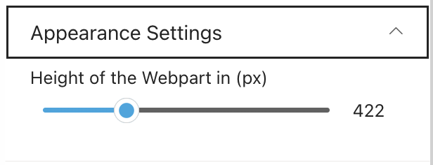
| Height of the Webpart (px) | How tall the org chart display area is. Range: 100–1200 px. Default: 535. | Slider |
📸 View Appearance Settings Screenshots
7. Upcoming Events
7. Upcoming Events
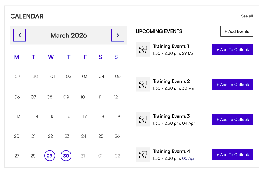
The Upcoming Events web part shows company events and dates from a SharePoint calendar, a shared mailbox, or the logged-in user's Outlook calendar.
📌 Header Settings
| Name | Purpose | Control Type |
|---|---|---|
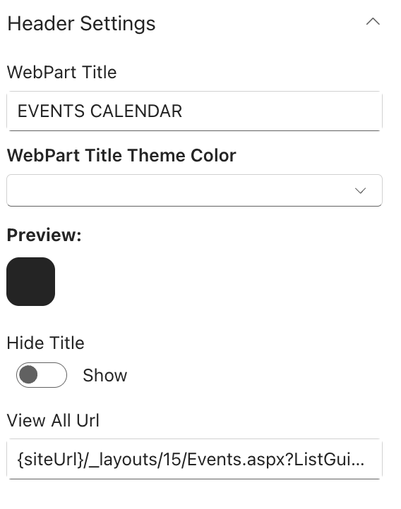
| Webpart Title | Heading shown above the events list (e.g. "Upcoming Events"). | Text field |
| WebPart Title Theme Color | Colour for the title text, from the site's theme palette. | Dropdown |
| Hide / Show title | Toggle the title bar on or off. | Toggle |
| View All URL | Web address for a "View All Events" link. Visible only when calendar view is off. | Text field |
📸 View Header Settings Screenshots
⚙️ General Settings
| Name | Purpose | Control Type |
|---|---|---|
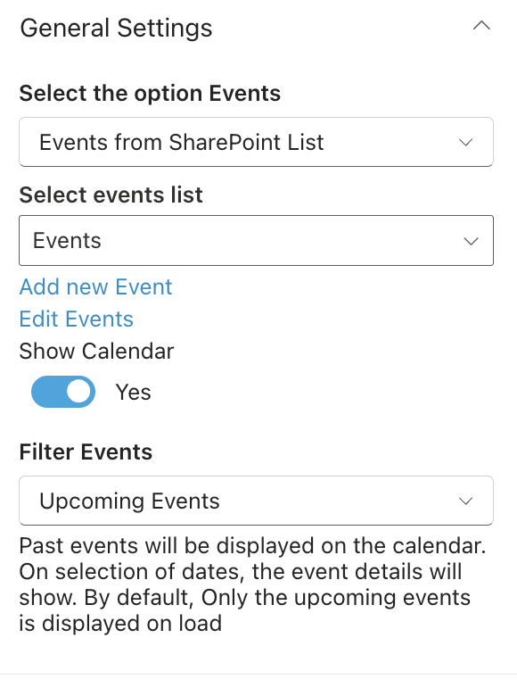
| Select the option Events | Choose the event source: Events from SharePoint List, Events from Shared Mailbox, or Events from Current User Outlook. | Dropdown |
| Select events list | Pick the calendar list on the current site. Visible only when SharePoint List is selected. | List picker |
| Add new Event | Quick link to add an event to the SharePoint calendar. Visible only when SharePoint List is selected. | Link |
| Edit Events | Quick link to manage events in the calendar. Visible only when SharePoint List is selected. | Link |
| Shared Mailbox Email ID | Email address of the shared mailbox to pull events from. Visible only when Shared Mailbox is selected. | Text field |
| Show Calendar | Toggle between a full monthly calendar view (Yes) or an events list only (No). | Toggle |
| Filter Events | Date range to display: Upcoming only, Previous 3 months + upcoming, Previous 6 months + upcoming, or Previous 12 months + upcoming. | Dropdown |
📸 View General Settings Screenshots
📐 Layout Settings
| Name | Purpose | Control Type |
|---|---|---|
| Choose Layout | Switch between Layout 1 (Standard) and Layout 2 (Accent Bar). | Dropdown |
🛠 Admin Settings
| Name | Purpose | Control Type |
|---|---|---|
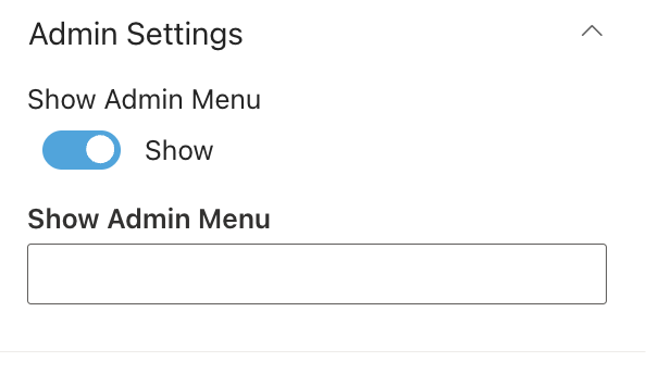
| Show / Hide admin badge | Toggle an admin badge visible only to designated administrators. | Toggle |
| Web Part Admin | People or groups who are administrators of this web part. | People picker |
📸 View Admin Settings Screenshots
8. Facilities
8. Facilities
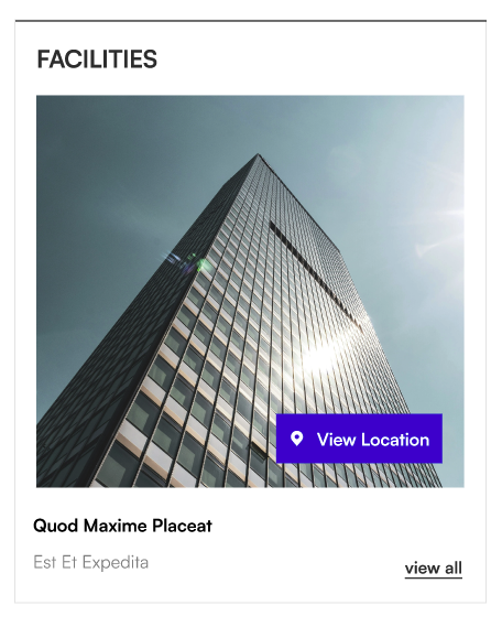
The Facilities web part showcases your organisation's offices and locations with photos, descriptions, and map links.
📌 Header Settings
| Name | Purpose | Control Type |
|---|---|---|
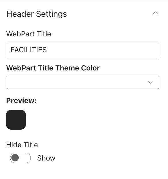
| Webpart Title | Heading shown above the facilities panel. | Text field |
| WebPart Title Theme Color | Colour for the title text, from the site's theme palette. | Dropdown |
| Hide / Show title | Toggle the title bar on or off. | Toggle |
📸 View Header Settings Screenshots
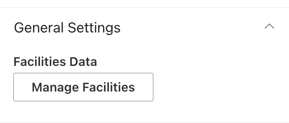
⚙️ General Settings
| Name | Purpose | Control Type |
|---|---|---|
| Manage Facilities | Opens a panel to add, edit, remove, and reorder facility entries. | Collection data |
Fields inside Manage Facilities:
| Field | Purpose | Control Type |
|---|---|---|
| Title | Name of the facility (e.g. "Head Office — London"). Required. | Text field |
| Map Address | A Google Maps or map URL for the location. Optional. | URL field |
| Content | A short description of the facility. Optional. | Text area |
| Thumbnail | Upload or select a photo for the facility. Stored in Site Assets. Optional. | File picker |
📸 View General Settings Screenshots
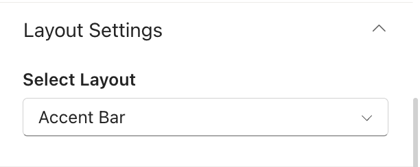
📐 Layout Settings
| Name | Purpose | Control Type |
|---|---|---|
| Select Layout | Switch between Standard and Accent Bar display styles. | Dropdown |
📸 View Layout Settings Screenshots
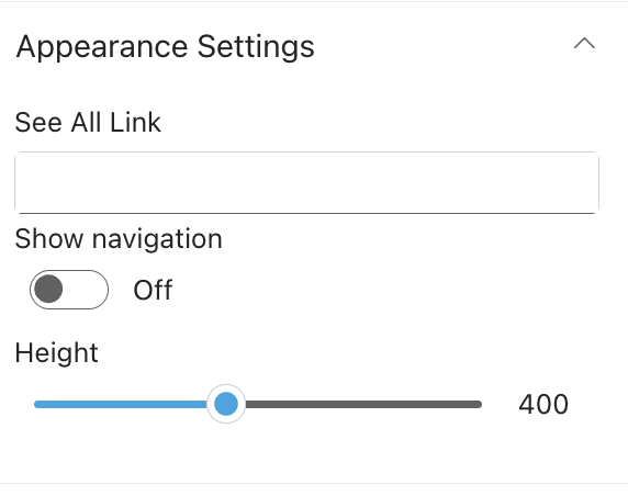
🎨 Appearance Settings
| Name | Purpose | Control Type |
|---|---|---|
| See All URL | Web address for a "View All" link to a full facilities listing page. | Text field |
| Show navigation | Toggle the navigation arrows and dots for browsing between facilities. | Toggle |
| Enable Auto Scroll | When on, the web part advances through facilities automatically. Visible only when navigation is on. | Toggle |
| Select duration to scroll | Seconds each facility is shown before auto-advancing. Range: 1–15 seconds. Visible only when Auto Scroll is on. | Slider |
| Height | Height of the facilities display area in pixels. Range: 250–600 px. | Slider |
📸 View Appearance Settings Screenshots
9. Message from CEO
9. Message from CEO
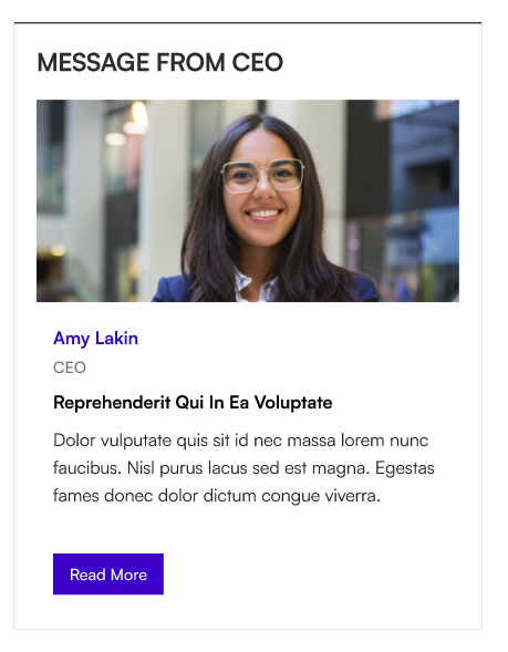
The Message from CEO web part displays a leadership message with a profile photo, designation, and message body. The full message opens in a modal overlay when users click to read more.
📌 Header Settings
| Name | Purpose | Control Type |
|---|---|---|
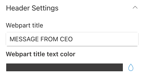
| Webpart title | Title shown above the message card (e.g. "Message from the CEO"). | Text field |
| Webpart title text color | Colour for the title text. | Colour picker |
📸 View Header Settings Screenshots
⚙️ General Settings
| Name | Purpose | Control Type |
|---|---|---|
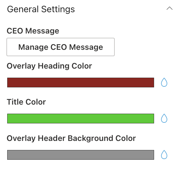
| Manage CEO Message | Opens a panel to set up the leadership message. Only one message is supported at a time. | Collection data |
| Overlay Heading Color | Colour of the heading text inside the modal overlay panel. | Colour picker |
| Title Color | Colour of the topic title text on the message card. | Colour picker |
| Overlay Header Background Color | Background colour of the header area inside the modal overlay panel. | Colour picker |
Fields inside Manage CEO Message:
| Field | Purpose | Control Type |
|---|---|---|
| Select Person | Search for and select the leader (e.g. the CEO) from your organisation. Their profile photo is used automatically. | People picker |
| Custom Image | Upload a custom photo to use instead of the person's directory photo. Stored in Site Assets. Optional. | File picker |
| Designation | The person's title or role (e.g. "Chief Executive Officer"). | Text field |
| Heading | Heading shown inside the overlay panel (e.g. "A Message from Our CEO"). | Text field |
| Title | Short topic title shown on the message card preview. | Text field |
| Content | The full message text. Required. Supports multiple lines. | Text area |
📸 View General Settings Screenshots
📐 Layout Settings
| Name | Purpose | Control Type |
|---|---|---|
| Choose Layout | Switch between Layout 1 (Standard card) and Layout 2 (Accent Bar with top border). | Dropdown |
🎨 Appearance Settings
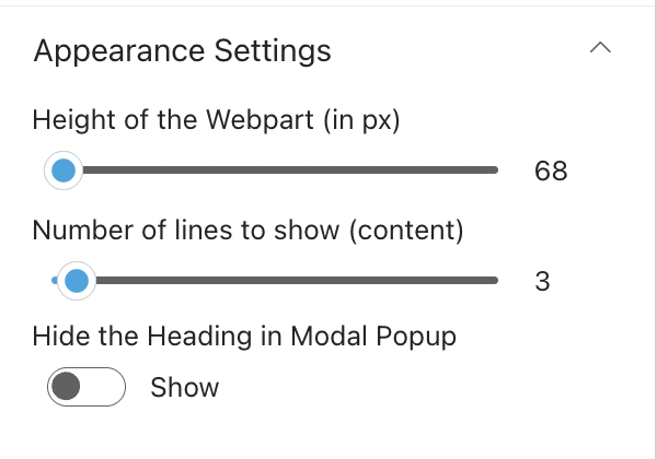
| Name | Purpose | Control Type |
|---|---|---|
| Height of the Webpart (px) | How tall the message card is. Range: 65–700 px. | Slider |
| Number of lines to show (content) | How many lines of the message preview are shown before cutting off with a "Read More" prompt. Range: 2–20. Default: 8. | Slider |
| Hide the Heading in Modal Popup | When on, the heading text inside the overlay panel is hidden. | Toggle |
📸 View Appearance Settings Screenshots