Configuration
Note:
The Home page should be configured using the "Healthcare 1 Setup" extension to ensure that the required lists and libraries are created automatically. Without this configuration, users will need to manually create dedicated lists or libraries for the respective web parts.
1. Set Up Wizard
-
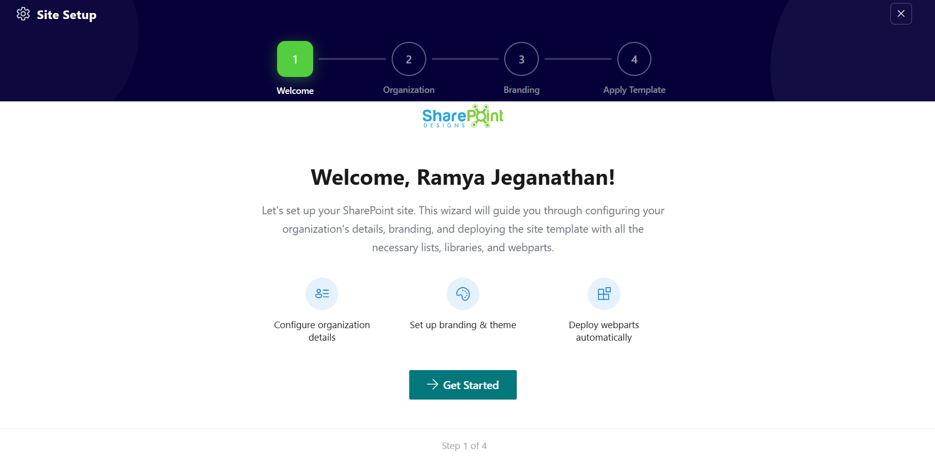
Since this is a first-time setup (or setup was not previously completed), a full-page Setup Wizard will automatically appear — no need to manually add any web part.
-
Walk through the wizard steps:
- Organizational Details — Enter your organization information.
- Branding — Upload your site logo. The wizard uses AI to automatically generate a brand color palette from the logo. You can review, adjust, or change the suggested colors before clicking Save and Apply Theme. You can also upload a custom favicon and configure regional settings.
- Deploy & Template — Deploy the intranet layout. Once deployed, the page is saved as a template so it can be reused later to recreate the site layout.
-
Do not close the browser during deployment. The wizard will create the required lists, libraries, and layout with sample data.
-
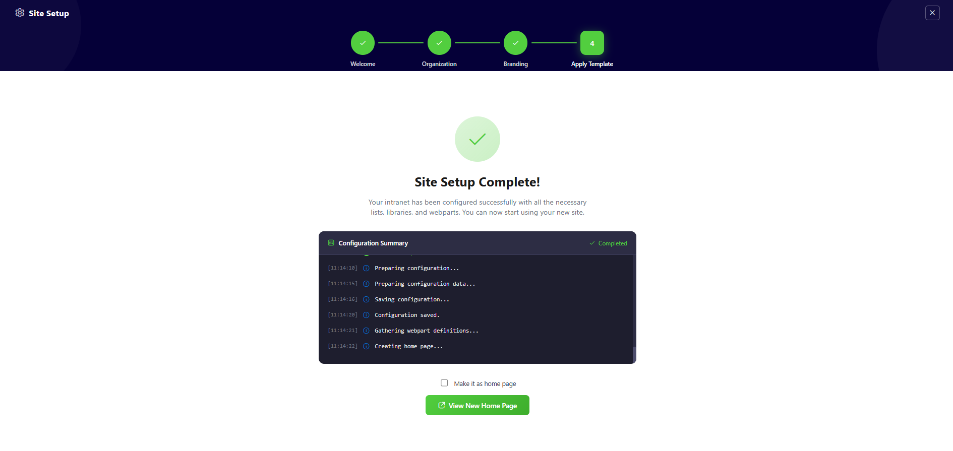
Once deployment is complete, you will be given the option to set the newly created page as your homepage. Click View Page to open the new page with the full Design 2 layout applied.
📸 View Property Panel Screenshots
After Setup
- The full-page wizard will no longer appear on page load.
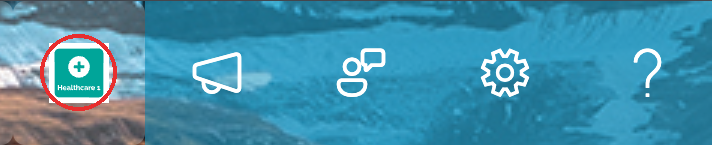
- You can relaunch the Setup Wizard at any time from the suite bar at the top of the site to update settings.
- Admins can return to the Deploy & Template step at any time to apply a saved template and recreate the site layout.
👋 2. Welcome Banner
📋 Details
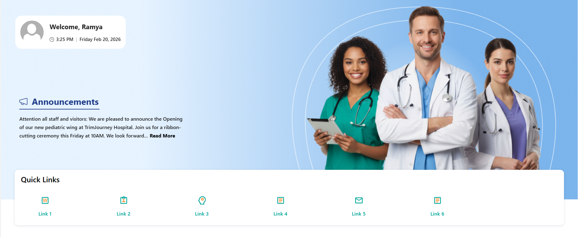
- Personalized Greeting Web Part: Displays a dynamic welcome message with the logged-in user’s name along with the current date and time..
- Announcements Display: Highlights important updates with preview text and a “Read More” option for detailed information.
- Custom Background Support: Allows a professional background image to enhance the visual appearance of the banner.
- Draggable Components:Enables repositioning of banner elements for flexible layout customization.
- Integrated Quick Links Section: Provides quick access to frequently used resources with icon-based navigation tiles..
☰ Appearance Settings
This section allows customization of the Welcome Banner and Quick Links display. The following configurable options are available:
📸 View Property Pane Screenshots
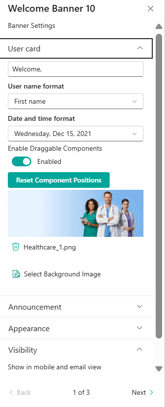
👤 User Card Settings
| 🏷️ Name | 🎯 Purpose | 💡 Select Option |
|---|---|---|
| 👋Welcome Text | Customizes the greeting text displayed before the user name. | Welcome, |
| 👤User Name Format | Defines how the logged-in user’s name appears (e.g., First name) | First Name |
| 🕒Date and Time Format | Controls the display format of the current date. | Wednesday, Feb 19, 2026 |
| 🧩Enable Draggable Components | Allows repositioning of banner elements within the layout. | Enabled |
| 🔄Reset Component Positions | Restores banner layout to its default state. | Button |
| 🖼️Select Background Image | Uploads or changes the banner background image. | Healthcare_1.png |
ℹ️ Announcement Settings
📸 View Property Pane Screenshots
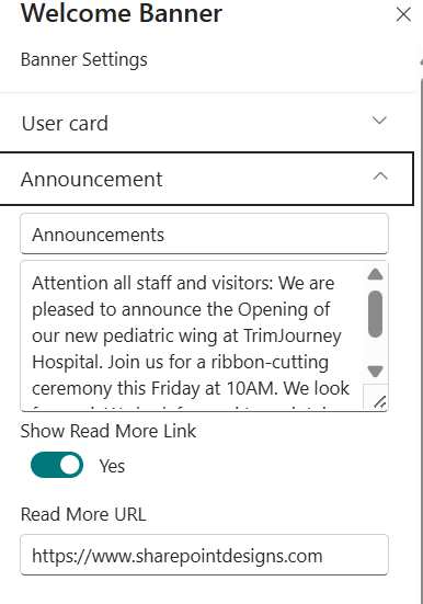
| 🏷️ Name | 🎯 Purpose | 💡 Select Option |
|---|---|---|
| 📢Announcement Title | Defines the heading displayed for the announcement section within the banner. This acts as the section label for the content below. | Announcements |
| 📝Announcement Description | Allows entry of the main announcement content. This text is displayed as a preview message in the banner area. Supports multi-line content for detailed updates. | Enter announcement text |
| 🔗Show Read More Link | When enabled, displays a clickable “Read More” link below the announcement preview to redirect users to additional details. | Yes |
| 🌐Read More URL | Specifies the destination URL that opens when users click the “Read More” link. | https://www.sharepointdesigns.com |
ℹ️ Appearance Settings
📸 View Property Pane Screenshots
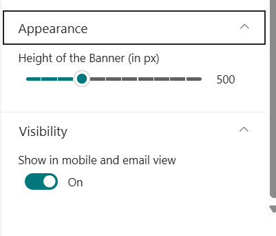
| 🏷️ Name | 🎯 Purpose | 💡 Select Option |
|---|---|---|
| 📐Height of the Banner (in px) | Allows the user to adjust the overall height of the welcome banner using a slider control. This helps control how much vertical space the banner occupies on the page. | 500 px |
🔗 Quick Links Settings
📸 View Property Pane Screenshots
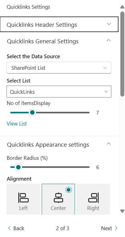
| 🏷️ Name | 🎯 Purpose | 💡 Select Option |
|---|---|---|
| 🗂️Select Data Source | Defines where the Quick Links data is collected from. | Data Collect From Panel |
| 📏Border Radius (%) | Adjusts the rounded corners of Quick Link tiles. | 7 |
| 📐Alignment | Aligns Quick Links horizontally within the section. | center |
| 🌈Border Radius (%) | Adjusts the rounded corners of Quick Link tiles. | Toggle |
| 📏Hide Gradient | Removes the gradient overlay from Quick Links. | 7 |
| ✨Hide Animation | Disables hover animation effects on Quick Links. | Toggle |
| 📏Icon Size | Controls the size of the Quick Link icons. | Dropdown |
| 🎨Text Color | Allows customization of the Quick Link text color to match branding or theme preferences. | Color Picker |
| 🖼️Show Only Icon or Image | When enabled, displays only the icon/image without link text. | Off |
| 🧱Show Border | Adds or removes a border around Quick Link tiles. | Off |
| 🔢No of Items Display | Defines the total number of Quick Link items displayed in the section. | 6 |
| 🌫️Show Box Shadow | Enables or disables shadow effect around Quick Link tiles | off |
ℹ️ About Section
📸 View Property Pane Screenshots

| 🏷️ Name | 🎯 Purpose |
|---|---|
| 👨💻Developer Info | Indicates the web part is developed bySharePoint Designs. |
| 📚Documentation Link | Provides access to user and admin documentation for further guidance. |
| 🔑Activate License Button | A button to activate the premium or licensed version of the web part, if applicable. |
🗺️ 3. Document Content
📋 Details
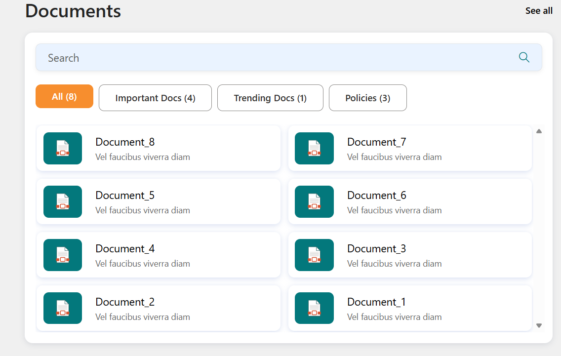
This web part offers support Document Content information,
- Dynamic Document Display Web Part: Displays documents from a selected SharePoint document library in a structured card layout.
- Search Functionality: Allows users to quickly search and filter documents within the web part.
- Category-Based Filtering: Supports filtering documents by category for better content organization.
- Header Customization: Includes configurable title, heading level, and optional “See All” link.
⚙️ Configuration Options
This section allows customization of the Document Library Web Part, including header configuration, content filtering, layout settings, and visibility options. The following configurable options are available:
📸 View Property Pane Screenshots
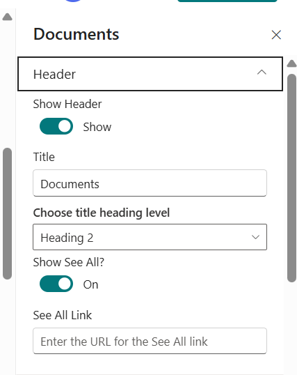
📌 Header Settings Section
| 🏷️ Name | 🎯 Purpose | 💡 Select Option |
|---|---|---|
| 📌Show Header | Enables or disables the header section of the web part. | Show |
| 📝Title | Sets the display title of the document library section. | Documents |
| 🔠Choose Title Heading Level | Defines the HTML heading level for the title (H1–H6). | Heading 3 |
| 🔗Show See All | Displays or hides the “See All” link in the header. | On |
| 🌐Show See All Link | Specifies the URL that opens when users click “See All”. | URL Field |
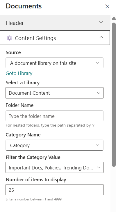
⚙️ Content settings Section
📸 View Property Pane Screenshots
| 🏷️ Name | 🎯 Purpose | 💡 Select Option |
|---|---|---|
| 📚Source | Defines the document source location. | A document library on this site |
| 📂Select a Library | Selects the document library to fetch documents from. | Healthcare Documents |
| 📁Folder Name | Filters documents from a specific folder (supports nested path using /). | Folder Path |
| 🏷️Category Name | Specifies the column used for category-based filtering. | Category |
| 🔎Filter the Category Value | Filters documents by a selected category value. | Dropdown |
| 🔢Number of Items to Display | Defines how many documents are displayed in the web part. | 25 |
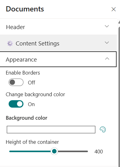
⚙️ Appearance settings Section
📸 View Property Pane Screenshots
| 🏷️ Name | 🎯 Purpose | 💡 Select Option |
|---|---|---|
| 🧱Enable Borders | Adds or removes borders around document cards. | off |
| 🎨Change Background Color | Enables custom background color for the web part container. | on |
| 🎨Height of the Web Part (px) | Adjusts the vertical height of the web part container. | 283 |
ℹ️ About Section
📸 View Property Pane Screenshots
| 🏷️ Name | 🎯 Purpose |
|---|---|
| 👨💻Developer Info | Indicates the web part is developed by SharePoint Designs. |
| 📚Documentation Link | Provides access to user and admin documentation for further guidance. |
| 🔑Activate License Button | A button to activate the premium or licensed version of the web part, if applicable. |
📚 4. Knowledge Hub
📋 Details
- Centralized Knowledge Display Web Part: Displays documents from a selected document library in a clean and structured layout.
- Scrollable Content Area: Supports vertical scrolling when multiple documents are available.
- Customizable Header Section: Allows control over title visibility and heading levels.
- Responsive & Visibility Control: Optimized for desktop, mobile, and email views.
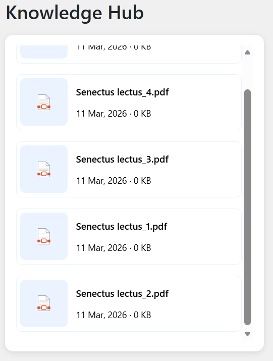
⚙️ Configuration Options
📌 Header Settings Section
📸 View Property Pane Screenshots
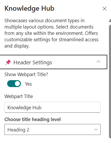
| 🏷️ Name | 🎯 Purpose | 💡 Select Option |
|---|---|---|
| 📌Show Webpart Title | Enables or disables the display of the Knowledge Hub title. | yes |
| 📝Webpart Title | Sets the display title of the web part. | Knowledge hub |
| 🔠Choose Title Heading Level | Defines the HTML heading level for the title (H1–H6). | Heading 3 |
| 🔗Show See All | Displays or hides the “See All” link in the header. | On |
| 🌐Show See All Link | Specifies the URL that opens when users click “See All”. | URL Field |
⚙️General Settings Section
📸 View Property Pane Screenshots
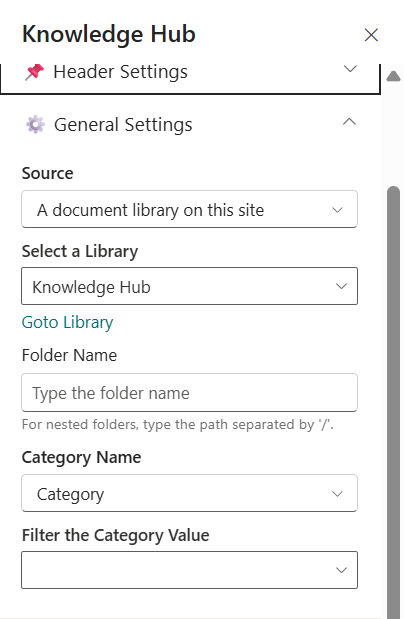
| 🏷️ Name | 🎯 Purpose | 💡 Select Option |
|---|---|---|
| 📚Source | Defines the document source location. | A document library on this site |
| 📂Select a Library | Selects the document library to fetch documents from. | Healthcare Documents |
| 📁Folder Name | Filters documents from a specific folder (supports nested path using /). | Folder Path |
| 🏷️Category Name | Specifies the column used for category-based filtering. | Category |
| 🔎Filter the Category Value | Filters documents by a selected category value. | Dropdown |
⚙️ Appearance settings Section
📸 View Property Pane Screenshots
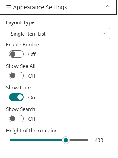
| 🏷️ Name | 🎯 Purpose | 💡 Select Option |
|---|---|---|
| 📚Layout Type* | Defines the visual layout style of the Knowledge Hub display. | Layout Option |
| 📂Enable Borders | Allows to enable border. | off |
| 📁Show See All | Allows to show or hide see All . | off |
| 🏷️Show date | Allows to show or hide date . | on |
| 🔎Height of the container | Adjust the height occurding to our requirement. | Slider |
🎨 Theme settings
📸 View Property Pane Screenshots

| 🏷️ Name | 🎯 Purpose | 💡 Select Option |
|---|---|---|
| 🎨Color of the Icon | Allows customization of the document icon color for branding consistency. | Color Picker |
ℹ️ About Section
📸 View Property Pane Screenshots
| 🏷️ Name | 🎯 Purpose |
|---|---|
| 👨💻Developer Info | Indicates the web part is developed bySharePoint Designs. |
| 📚Documentation Link | Provides access to user and admin documentation for further guidance. |
| 🔑Activate License Button | A button to activate the premium or licensed version of the web part, if applicable. |
📰 5. News
Showcase concise company updates in a clean, minimal layout. Integrates with SharePoint news or RSS feeds.
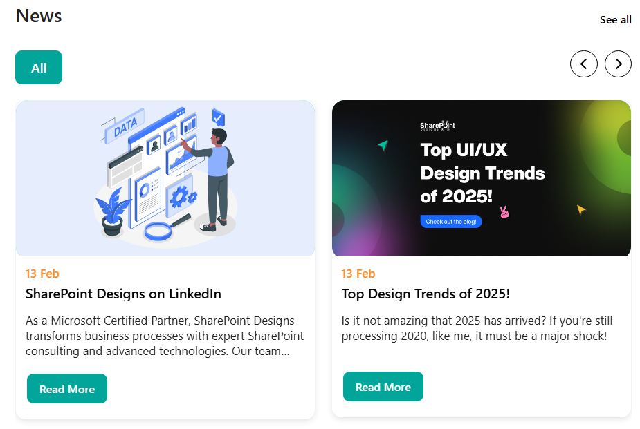
⚙️ Configuration
📸 View Property Pane Screenshots
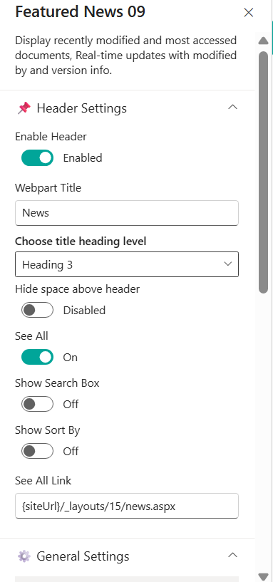
📌 Header Settings Section
| 🏷️ Name | 🎯 Purpose | 💡 Select Option |
|---|---|---|
| 📌Show Webpart Title | Enables or disables the display of the Knowledge Hub title. | yes |
| 📝Webpart Title | Sets the display title of the web part. | Knowledge hub |
| 🔠Choose Title Heading Level | Defines the HTML heading level for the title (H1–H6). | Heading 3 |
| 🔗Show See All | Displays or hides the “See All” link in the header. | On |
| 🌐Show See All Link | Specifies the URL that opens when users click “See All”. | URL Field |
| 🌐Show Search Box | Display or hide the search boxes”. | false |
| 🌐Show sort by | Display or hide the sort by options ”. | false |
General Settings
Details
📸 View Property Pane Screenshots
| 🏷️ Name | 🎯 Purpose | 💡 Select Option |
|---|---|---|
| Search Sites | Select source sites | Current site |
| Enable RSS Feed | Enable RSS integration | On |
| RSS Links | Manage external feeds | [Manage Links] |
Layout Settings
📸 View Property Pane Screenshots
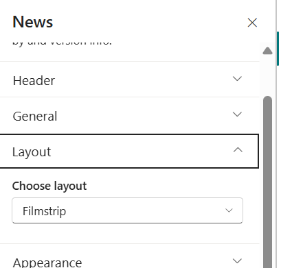
| 🏷️ Name | 🎯 Purpose | 💡 Select Option |
|---|---|---|
| Choose Layout | Select Layout | Filmstrip |
Appearance Settings
📸 View Property Pane Screenshots
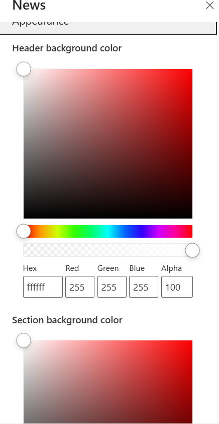
| 🏷️ Name | 🎯 Purpose | 💡 Select Option |
|---|---|---|
| 🎨Header Background Color | Allows the user to customize the background color of the banner header area. Includes a color picker, gradient selector, and manual input fields (Hex, RGB, Alpha) for precise color control and transparency adjustment. | #FFFFFF (Alpha: 100%) |
| 🧱Section Background Color | Enables customization of the background color for the main content section below the header. Supports full color selection and opacity control to match branding requirements. | Custom color selection |
ℹ️ About Section
📸 View Property Pane Screenshots
| 🏷️ Name | 🎯 Purpose |
|---|---|
| 👨💻Developer Info | Indicates the web part is developed bySharePoint Designs. |
| 📚Documentation Link | Provides access to user and admin documentation for further guidance. |
| 🔑Activate License Button | A button to activate the premium or licensed version of the web part, if applicable. |
🏢 6. Organisation Chart
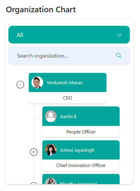
This web part will display a chart showing the organizational structure of the company based on the selected SharePoint site or list. It uses the Microsoft Graph API to query the user profiles and build the hierarchy.
⚙️ Configuration
Header Settings
📸 View Header settings Screenshot
📌 Header Settings Section
| 🏷️ Name | 🎯 Purpose | 💡 Select Option |
|---|---|---|
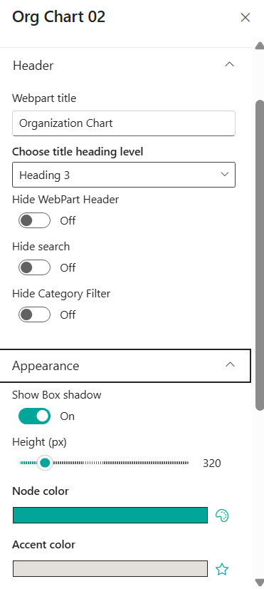
| 📌Show Webpart Title | Enables or disables the display of the Knowledge Hub title. | yes |
| 📝Webpart Title | Sets the display title of the web part. | Knowledge hub |
| 🔠Choose Title Heading Level | Defines the HTML heading level for the title (H1–H6). | Heading 3 |
| 🔗Show See All | Displays or hides the “See All” link in the header. | On |
| 🌐Show See All Link | Specifies the URL that opens when users click “See All”. | URL Field |
| 🌐Show Search Box | Display or hide the search boxes. | false |
| 🌐Hide Category Filter | Display or hide the cataegory filter options boxes. | true |
📌 Appearance Settings Section
📸 View Property Pane Screenshots
| 🏷️ Name | 🎯 Purpose | 💡 Select Option |
|---|---|---|
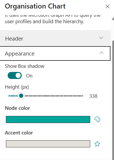
| 📌Show Box shadow | Enables or disables the display the box shadow. | on |
| 📝Height | Sets the height of the webpart . | 320 |
| 🔠Node Color | Allows to choose node color. | Color picker |
| 🔠Accent Color | Allows to choose Accent color. | Color picker |
📌 Filter Settings Section
📸 View Property Pane Screenshots

| 🏷️ Name | 🎯 Purpose | 💡 Select Option |
|---|---|---|
| 📌Enable Category Filter | Allows you to choose whether the category filter have to show or hide . | on |
| 📝Filter Field | We can able to filter it by fields . | Job Title |
ℹ️ About Section
📸 View Property Pane Screenshots
| 🏷️ Name | 🎯 Purpose |
|---|---|
| 👨💻Developer Info | Indicates the web part is developed by SharePoint Designs. |
| 📚Documentation Link | Provides access to user and admin documentation for further guidance. |
| 🔑Activate License Button | A button to activate the premium or licensed version of the web part, if applicable. |
📅 7. Calendar
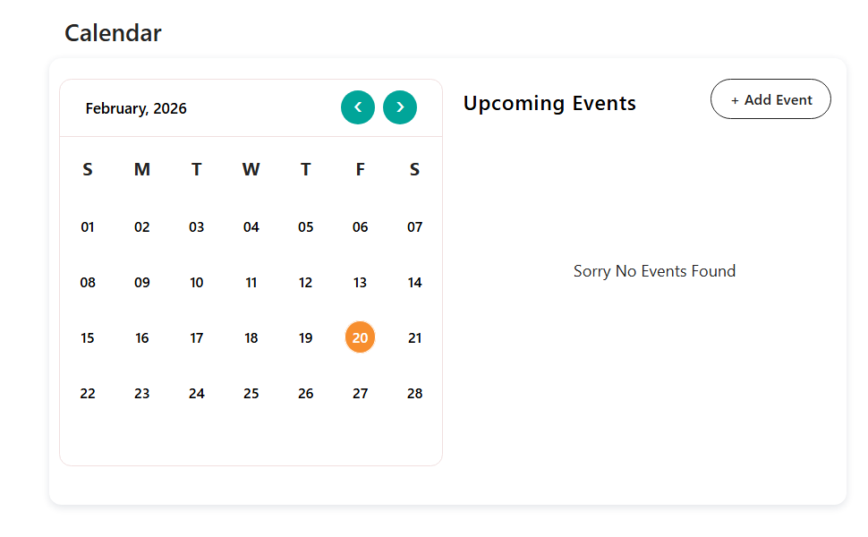
Show upcoming meetings, holidays, and key events in a clear monthly or weekly calendar format.
⚙️ Configuration
📌 Header Settings Section
📸 View Property Pane Screenshots
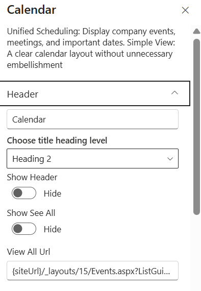
| 🏷️ Name | 🎯 Purpose | 💡 Select Option |
|---|---|---|
| 📌 Hide Title | Enables or disables the display of the Knowledge Hub title. | yes |
| 📝Webpart Title | Sets the display title of the web part. | Knowledge hub |
| 🔠Choose Title Heading Level | Defines the HTML heading level for the title (H1–H6). | Heading 3 |
| 🔗Show See All | Displays or hides the “See All” link in the header. | On |
| 🌐Show See All Link | Specifies the URL that opens when users click “See All”. | URL Field |
⚙️ Content Settings
📸 View General Settings Screenshot
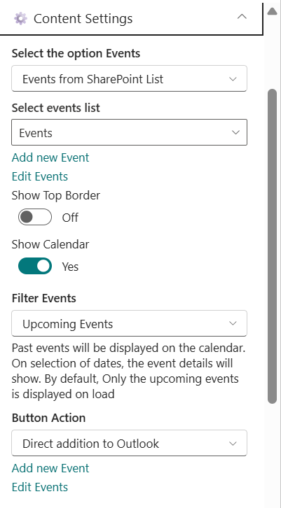
| 🏷️ Name | 🎯 Purpose | 💡 Select Option |
|---|---|---|
| Select the Option Events | Allows to choose the list | Dropdown |
| Selects events list | Allows to choose event type | Dropdown |
| Add events | Add events from here | Event creator |
| Edit list | Allows to edut the existing events | Event creator |
| Show calendar | Allows to choose display or hide the calendar | Boolean |
| Filter Events | can filter events as per our choice | Dropdown |
| Button Action | we can able to add this in to Outlook or download as ICS file | Dropdown |
ℹ️ About Section
📸 View Property Pane Screenshots
| 🏷️ Name | 🎯 Purpose |
|---|---|
| 👨💻Developer Info | Indicates the web part is developed bySharePoint Designs. |
| 📚Documentation Link | Provides access to user and admin documentation for further guidance. |
| 🔑Activate License Button | A button to activate the premium or licensed version of the web part, if applicable. |
🎥 8. Townhall Meeting video
📋 Details
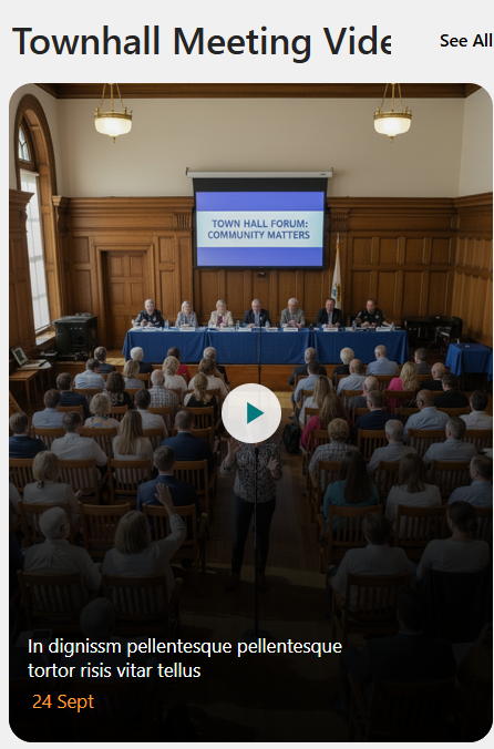
- Townhall Showcase Web Part: Displays important townhall meetings, recordings, or announcements in a structured and engaging format.
- Content Type Selection: Allows selection of predefined content types such as Town Hall Recordings.
- Custom Description Support: Enables adding a custom description for context or messaging.
- Interactive Button Configuration: Supports customizable button icon and recording link integration.
- Flexible Media Source: Allows selecting the content source type (e.g., Video).
⚙️ Configuration
📌 Header Settings Section
📸 View Property Pane Screenshots
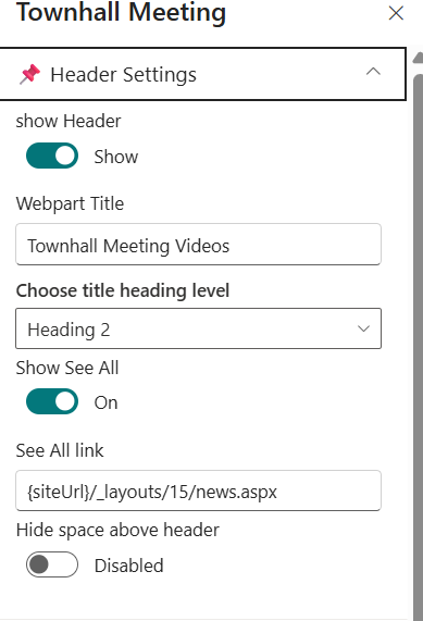
| 🏷️ Name | 🎯 Purpose | 💡 Select Option |
|---|---|---|
| 📌 Show Header | Enables or disables the display of the Knowledge Hub title. | yes |
| 📝Webpart Title | Sets the display title of the web part. | Knowledge hub |
| 🔠Choose Title Heading Level | Defines the HTML heading level for the title (H1–H6). | Heading 3 |
| 🔗Show See All | Displays or hides the “See All” link in the header. | On |
| 🌐Show See All Link | Specifies the URL that opens when users click “See All”. | URL Field |
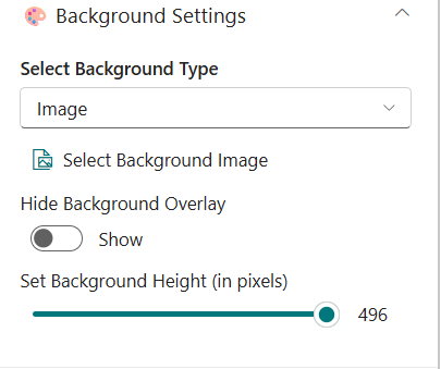
⚙️ Background Settings
📸 View Property Pane Screenshots
| 🏷️ Name | 🎯 Purpose | 💡 Select Option |
|---|---|---|
| 🧮Select Background Type | Defines the type of background used for the banner. Allows switching between image-based or other supported background styles. | Image |
| 📁Select Background Image | Enables the user to upload or choose an image that will be displayed as the banner background. | Select Image |
| 🌫️Hide Background Overlay | Controls the visibility of the overlay layer placed above the background image. When disabled, the overlay remains visible to improve text readability. | Show |
| 📏Set Background Height (in pixels) | Adjusts the vertical height of the background area using a slider control, allowing precise layout customization. | 496 px |
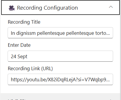
⚙️ Recording Configuration
📸 View Property Pane Screenshots
| 🏷️ Name | 🎯 Purpose | 💡 Select Option |
|---|---|---|
| 🎬Recording Title | Specifies the title of the recorded session or video. This title will be displayed as the main heading for the recording section. | Enter recording title |
| 📅Enter Date | Defines the date associated with the recording (e.g., event date or upload date). This helps users identify when the session took place. | 24 sept |
| 🔗Recording Link (URL) | Provides the direct URL to the recording (e.g., YouTube, Stream, or internal video link). Users will be redirected to this link to view the recording. | URL Field |
| 🎥Choose the Source | Defines the media source type for the townhall content. | https://youtu.be/... |
ℹ️ About Section
📸 View Property Pane Screenshots
| 🏷️ Name | 🎯 Purpose |
|---|---|
| 👨💻Developer Info | Indicates the web part is developed bySharePoint Designs. |
| 📚Documentation Link | Provides access to user and admin documentation for further guidance. |
| 🔑Activate License Button | A button to activate the premium or licensed version of the web part, if applicable. |