Configuration
Note:
The Home page should be configured using the "Design 1 Setup" web part to ensure that the required lists and libraries are created automatically. Without this configuration, users will need to manually create dedicated lists or libraries for the respective web parts.
1. Set Up Wizard

-
Since this is a first-time setup (or setup was not previously completed), a full-page Setup Wizard will automatically appear — no need to manually add any web part.

-
Walk through the wizard steps:
- Organizational Details — Enter your organization information.
- Branding — Upload your site logo. The wizard uses AI to automatically generate a brand color palette from the logo. You can review, adjust, or change the suggested colors before clicking Save and Apply Theme. You can also upload a custom favicon and configure regional settings.
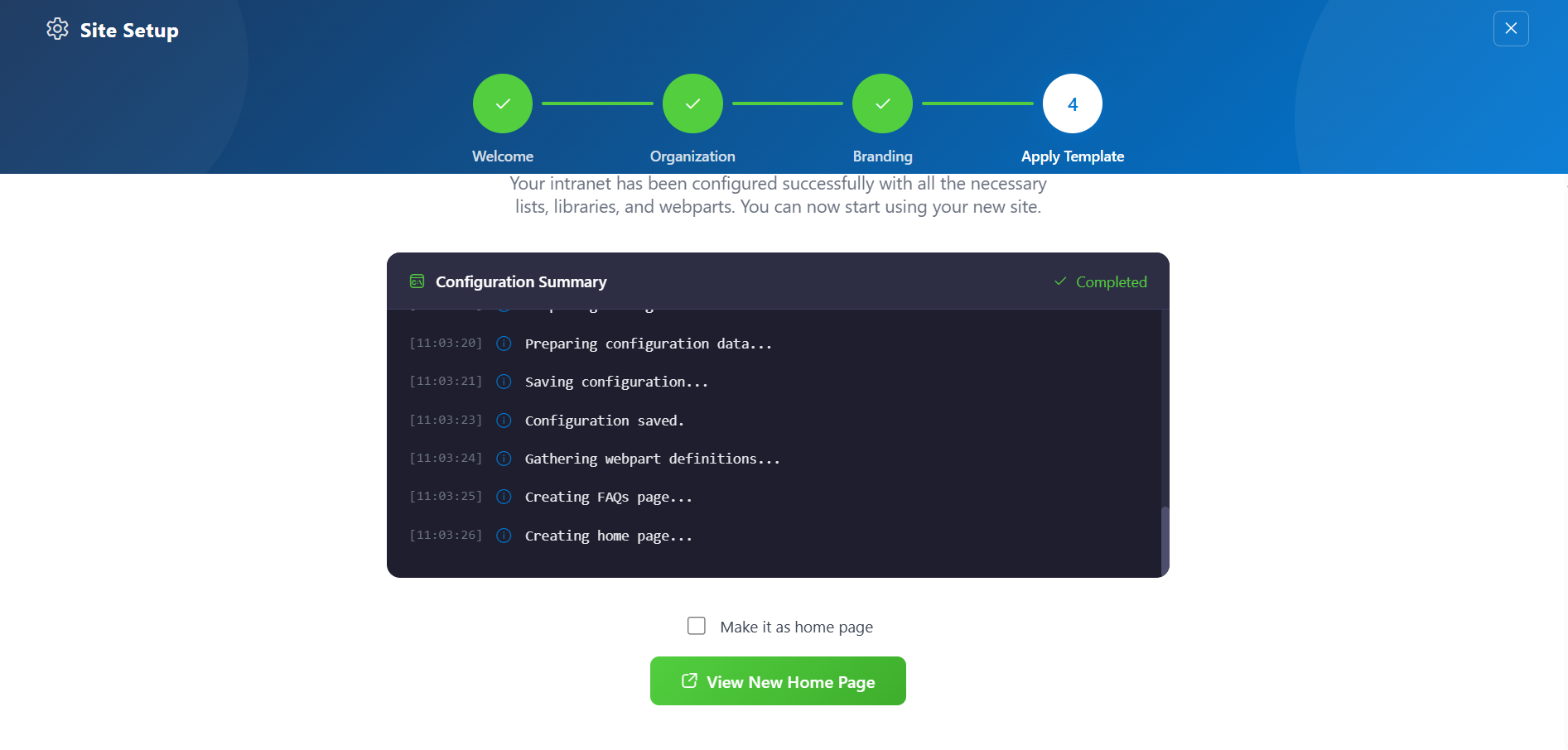
- Deploy & Template — Deploy the intranet layout. Once deployed, the page is saved as a template so it can be reused later to recreate the site layout.
-
Do not close the browser during deployment. The wizard will create the required lists, libraries, and layout with sample data.
-
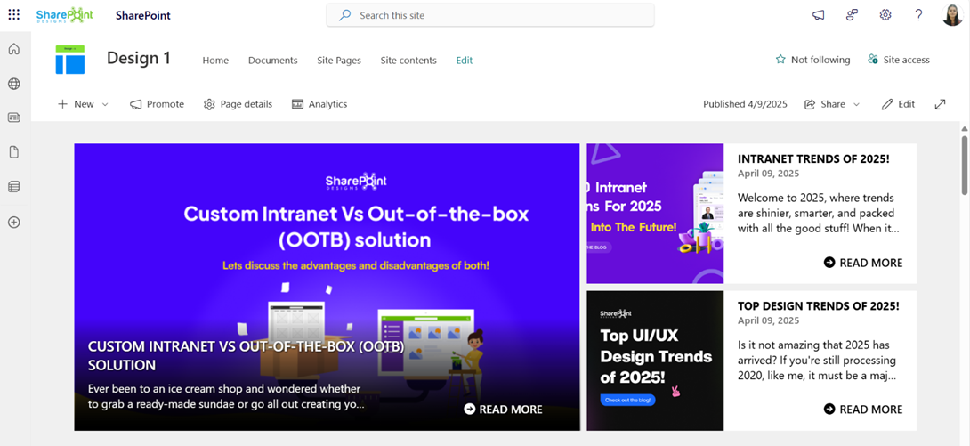
Once deployment is complete, you will be given the option to set the newly created page as your homepage. Click View Page to open the new page with the full Design 2 layout applied.
📸 View Property Panel Screenshots
After Setup
- The full-page wizard will no longer appear on page load.
- You can relaunch the Setup Wizard at any time from the suite bar at the top of the site to update settings.
- Admins can return to the Deploy & Template step at any time to apply a saved template and recreate the site layout.
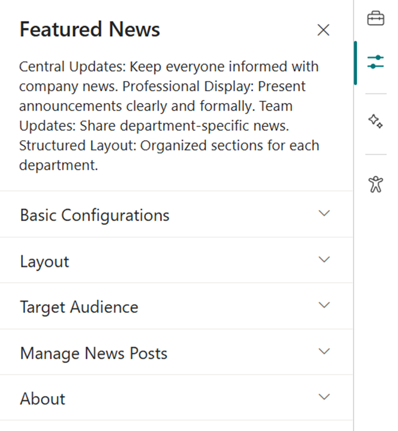
📰 2. Featured News
📋 Details
- Central Updates: Keep everyone informed with company news.
- Professional Display: Present announcements/department news clearly and formally.
- Structured Layout: Organized sections for each department.
🏷️ Features News Web Part – Property Pane Configuration
📸 View Property Pane Screenshots
🎨 Appearance Settings
| 🏷️ Name | 🎯 Purpose | 💡 Select Option |
|---|---|---|
| Choose Layout | Select layout style for news display | Top Story, Grid, Filmstrip, Tiles |
| Show Category Filter | Note: This should be enabled only if the news is tagged to any category. Toggle to enable filtering content by category. | Off |
| News Category | Select the available choice column to apply filters. | choose available choice column |
| Apply Filters | Select the available options from the News Category selected. | (Not Selected) |
| Show Search Box | Allow users to search news articles | On / Off |
| Show Sort By | Add sorting option to reorder news content | On / Off |
⚙️ General Settings
| 🏷️ Name | 🎯 Purpose | 💡 Select Option |
|---|---|---|
| Webpart Title | Title displayed at the top of the news web part | Features News |
| Search Sites | Select SharePoint sites to pull news from | (Leave blank for current) |
| Filter by Tag | Filter news items by tags (e.g., Departments, Announcements) | Enter tags |
| Enable RSS Feed | Toggle RSS feed functionality on/off | On / Off |
| Show See All Button | Toggle visibility of “See All” button | On / Off |
| View All URL | Custom URL for the “See All” button | {siteUrl}/_layouts/15/news.aspx |
🎯 Target Audience
| 🏷️ Name | 🎯 Purpose | 💡 Select Option |
|---|---|---|
| Target Audience | Show news posts only to selected users using targeting | Select audience group |
🛠️ Manage News Posts
| 🏷️ Name | 🎯 Purpose | 💡 Select Option |
|---|---|---|
| Manage News Posts | View and manage all published and draft news posts | Open news management page |
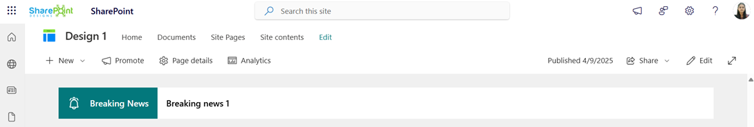
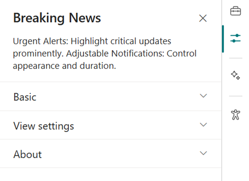
🚨 3. Breaking News
📋 Details
Deliver urgent and time-sensitive information with high visibility:
- Urgent Alerts: Ideal for critical updates such as service outages, emergency messages, or security notifications.
- Adjustable Notification: Customize alert appearance and visibility duration.
List Config
Note: For the Breaking News webpart, create a list with the following columns.
📋 Required Columns
| 🏷️ Column Name (Case Sensitive) | 🔣 Column Type | 💡 Option |
|---|---|---|
| Link | Hyperlink | |
| Expiry Date | Datetime | |
| Order By | Number | |
| Target Window | Choice | (Open in new tab, Open in same tab) |
🏷️ Breaking News Web Part – Property Pane Configuration
📸 View Property Pane Screenshots
🎨 Appearance Settings
| 🏷️ Name | 🎯 Purpose | 💡 Select Option |
|---|---|---|
| Webpart Title | Set a custom title for the web part display | Breaking News |
| Sub Title | Add a custom inline subtitle | (Text input) |
| Select a List | Choose the SharePoint list with alert content | Breaking News List |
| Change Icon | Pick an icon representing urgency/type | (Icon picker) |
| Show Arrows | Enable or disable navigation arrows | On / Off |
⚙️ General Settings
| 🏷️ Name | 🎯 Purpose | 💡 Select Option |
|---|---|---|
| Notification Duration | Set how long the alert remains visible | (Seconds or minutes) |
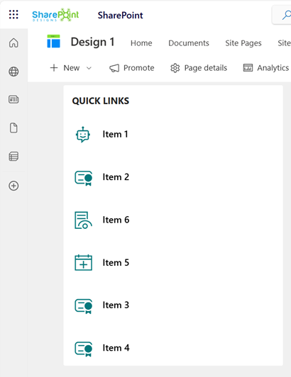
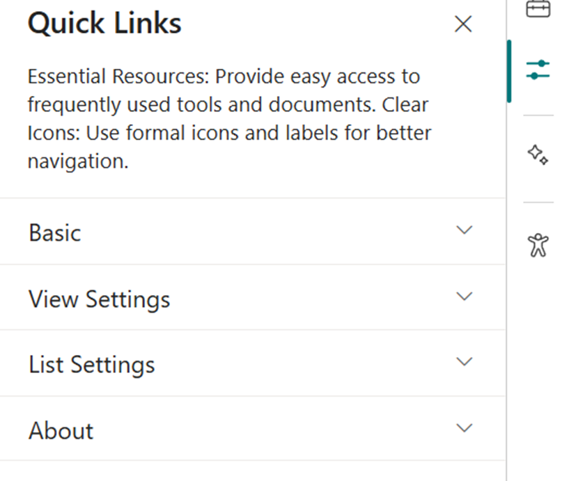
🔗 4. Quick Links
📋 Details
Provide fast and intuitive access to essential resources:
- Essential Resources: Direct users to frequently used tools, forms, documents, and company policies.
- Icons & Labels: Enhance navigation with clearly labeled links and intuitive icons.
List Config
Note: For the Quick Links/Tool Links webpart, create a list with the following columns.
📋 Required Columns
| 🏷️ Column Name (Case Sensitive) | 🔣 Column Type | 💡 Option |
|---|---|---|
| URL | URL | |
| Icon | Image | |
| Target Window | Choice | (Yes, No) |
| Order0 | Number |
🏷️ Quick Links Web Part – Property Pane Configuration
📸 View Property Pane Screenshots
🎨 Appearance Settings
| 🏷️ Name | 🎯 Purpose | 💡 Select Option |
|---|---|---|
| Webpart Title | Set a custom title to label the web part | Quick Links |
| Select a List | Choose the SharePoint list for links | Tool Links / Quick Links |
| Layouts | Choose layout style | Vertical / Horizontal |
⚙️ General Settings
| 🏷️ Name | 🎯 Purpose | 💡 Select Option |
|---|---|---|
| View List | Quickly access the connected list for edits | Open List |
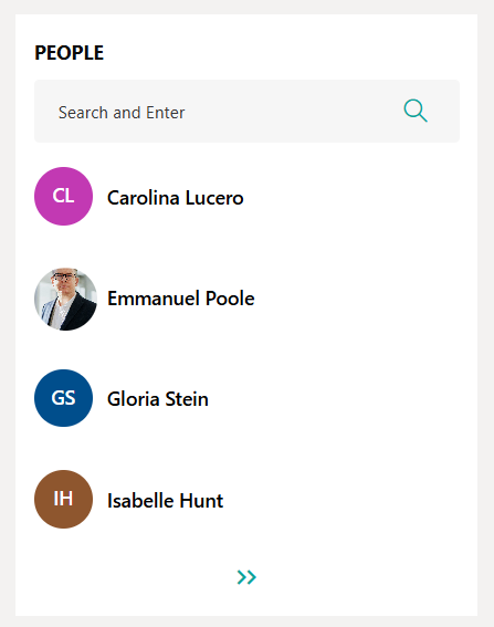
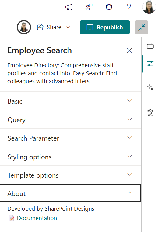
👥 5. Employee Search
📋 Details
Easily browse and discover employee information across the organization:
- Employee Directory: View detailed staff profiles including name, role, contact info, and more.
- Easy Search: Use advanced filters to quickly locate team members by department, job title, or other attributes.
🏷️ Employee Search Web Part – Property Pane Configuration
📸 View Property Pane Screenshots
🎨 Appearance & Query Settings
| 🏷️ Name | 🎯 Purpose | 💡 Select Option |
|---|---|---|
| Webpart Title | Enter a custom title for the web part | Employee Search |
$filter | Filter users by Microsoft Graph properties (e.g.,jobTitle eq 'HR Manager') | Text input |
$orderby | Sort user results (e.g.,displayName asc) | Dropdown |
| Number of Items/Page | Set how many user profiles show per page | Number input |
$search | Configure search behavior | Text input |
| Show Pagination | Enable navigation controls to browse additional users | On / Off |
| Show Blank if None | Display nothing if no results found | On / Off |
| Show Results Count | Show total matching user count | On / Off |
| Show Live Persona Card | Display detailed user info on hover | On / Off |
| Results Layout | Choose the layout style for results (e.g.,People) | Dropdown |
🧩 Template Options
| 🏷️ Name | 🎯 Purpose | 💡 Select Option |
|---|---|---|
| Manage Persona Fields | Customize which user fields appear | Field selector |
| Picture Size | Set profile picture size | Small / Medium / Large |
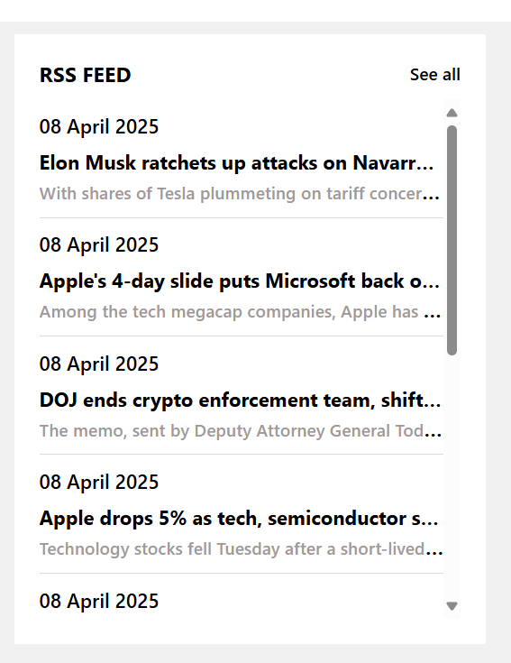
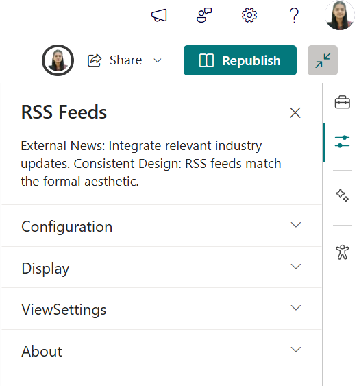
📰 6. RSS Feed
📋 Details
Integrate external news sources directly into your intranet for broader visibility:
- External News Integration: Pulls in news from trusted sources like Microsoft, TechCrunch, and more.
- Unified Design: Seamlessly styled to match internal news web parts.
- Content Preview: Displays headline, summary, and publication date for quick insights.
🏷️ RSS Feed Web Part – Property Pane Configuration
📸 View Property Pane Screenshots
🎨 Basic Configurations
| 🏷️ Name | 🎯 Purpose | 💡 Select Option |
|---|---|---|
| Webpart Title | Enter a custom title for the web part | Text input |
| RSS URL | Add the URL for the RSS feed | URL input |
| RSS API Key | Paste API key if required | Text input |
🔧 Feed Controls
| 🏷️ Name | 🎯 Purpose | 💡 Select Option |
|---|---|---|
| Max Count Per Page | Number of feed items to display per page | Slider / Number input |
🎛️ Additional Settings
| 🏷️ Name | 🎯 Purpose | 💡 Select Option |
|---|---|---|
| See All Button | Enable or disable the “See All” button | On / Off |
| View All URL | Link the “See All” button redirects to | URL input |
| Webpart Height | Adjust the height of the web part | Slider / Number input |
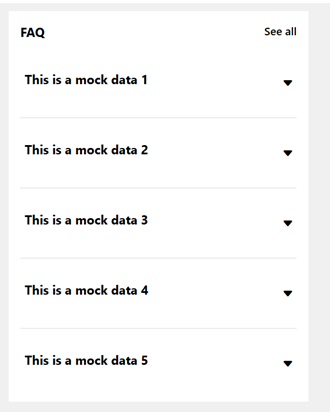
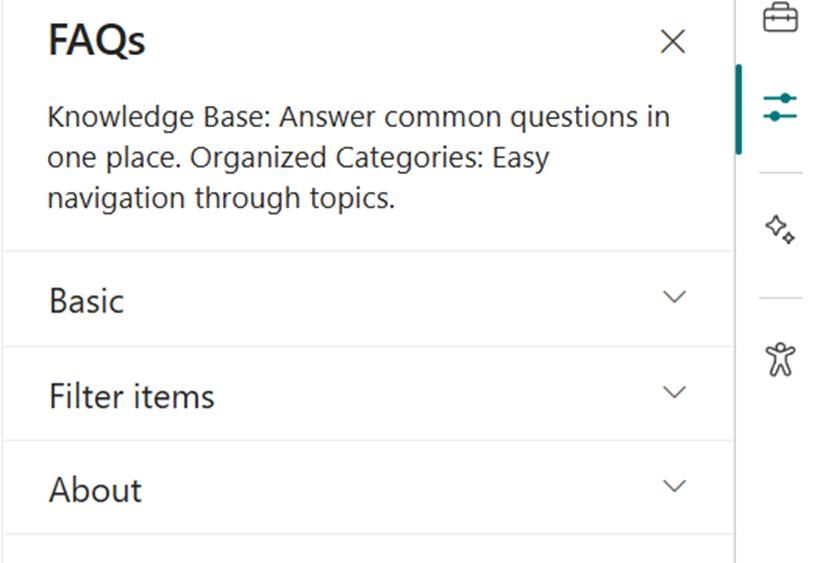
❓ 7. FAQs
📋 Details
Provide a centralized knowledge base for commonly asked questions:
- Knowledge Base: Easily accessible answers to frequent employee or customer inquiries.
- Organized Categories: FAQs are grouped into categories for smoother navigation and quicker discovery.
List Config
Note: For the FAQs webpart, create a list with the following columns.
📋 Required Columns
| 🏷️ Column Name (Case Sensitive) | 🔣 Column Type |
|---|---|
| Description | Multiline |
| Order0 | Number |
🏷️ FAQs Web Part – Property Pane Configuration
📸 View Property Pane Screenshots
🎨 Basic Settings
| 🏷️ Name | 🎯 Purpose | 💡 Select Option |
|---|---|---|
| Webpart Title | Customize the title above the FAQs section | Text input |
| Select a List | Choose the SharePoint FAQs list with questions & answers | Dropdown |
| Height | Adjust the height of the web part | Number input |
| Display All Items | Toggle to show all FAQs or limit the number displayed | On / Off |
| Items to Show | Number of FAQ items to display when not showing all | Number input |
| View All URL | Link to a full FAQ page if available | URL input (default{siteUrl}/Lists/FAQs/AllItems.aspx) |
🔤 Filter Items
| 🏷️ Name | 🎯 Purpose | 💡 Select Option |
|---|---|---|
| Sort By | Order FAQsA to Z or Z to A | Dropdown |
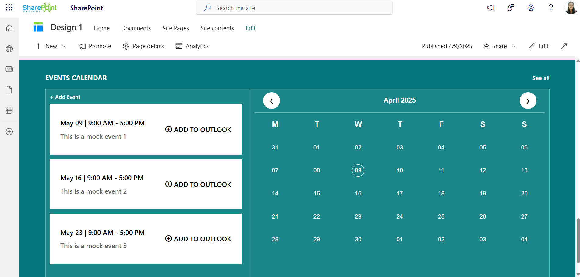
📅 8. Events Calendar
📋 Details
Keep everyone updated with key organizational dates and activities:
- Event Calendar: Displays company meetings, events, holidays, and other important dates.
- Detailed Info: Includes date, time, location, and other essential details for each event.
🏷️ Events Calendar Web Part – Property Pane Configuration
📸 View Property Pane Screenshots
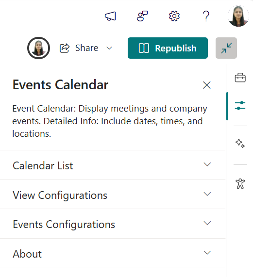
⚙️ Configuration Options
Calendar List
| 🏷️ Name | 🎯 Purpose | 💡 Notes |
|---|---|---|
| Calendar List | Quick access to the connected SharePointEvents list |
View Configurations
| 🏷️ Name | 🎯 Purpose | 💡 Notes |
|---|---|---|
| Webpart Title | Customize the title appearing above the calendar | Text input |
| Select a List | Choose theevents list from the dropdown to display event data | Dropdown |
| Filter Events | Note: If the filter option is set to "Upcoming Events", both the calendar and the events section will display only upcoming events.If the filter option is set to "Previous 3 months + Upcoming Events", the calendar will show both past (from the last 3 months) and upcoming events, while the events section will continue to display only upcoming events.Dropdown to filter event types shown in the web part | Dropdown months filter options |
| Show Calendar | Toggle to show or hide the visual calendar interface | On / Off |
| View All URL | Link to full events listing page Default: {siteUrl}/_layouts/15/Events.aspx?ListGuid={listID} | URL input |
| Show Event Icons | Enable or disable category icons for each event | On / Off |
Event Configurations
| 🏷️ Name | 🎯 Purpose | 💡 Notes |
|---|---|---|
| Add New Event | Opens form to add new event | Button / Link |
| Edit Events | Redirects to events list for editing | Button / Link |